Cineplex Mobile App Redesign
Redesigning the Cineplex mobile app to improve navigation, user flows, and UI consistency — driven by user research and a passion for better movie-going experiences.
Context
Cineplex is a Canadian brand known for its operation in film entertainment, providing a unique escape from everyday life to millions of guests through its network of over 170 movie theatres. The Cineplex mobile app allows customers to purchase tickets and enter theatres using digital tickets for a paperless experience.
However, I experienced frustrating user interfaces and flows while using the app, and reviews on the Google Play Store and App Store confirmed I wasn't alone. The primary focus of this project is to redesign the UI, address identified pain points, and enhance the current experience.
UX Research
To understand user pain points, the project began with a research phase analyzing reviews from the Google Play Store and Apple App Store.
Qualitative Research — App Analytics
The research methodology was qualitative UX research — a widely recognized approach for understanding motivations, thoughts, and attitudes of a target audience. App analytics played an essential role in assessing difficulties experienced by users, identifying existing problems while gaining an understanding of the current user experience.
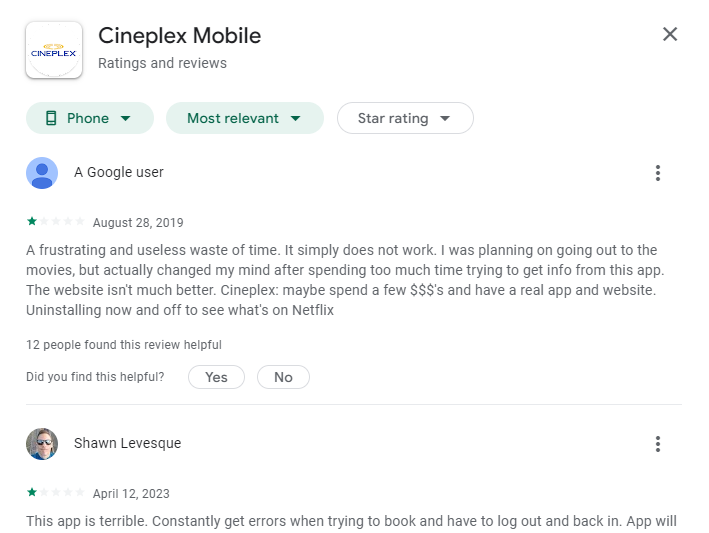
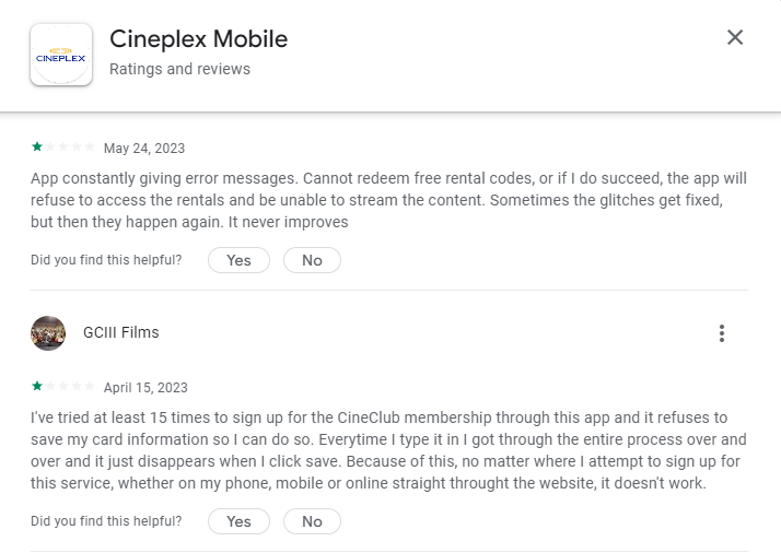
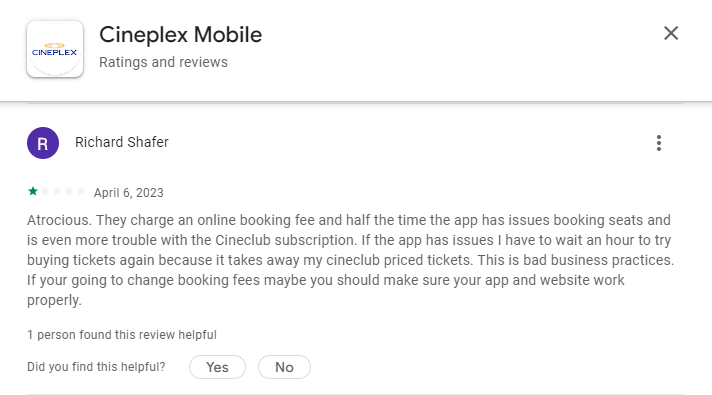
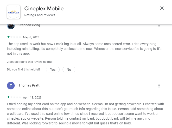
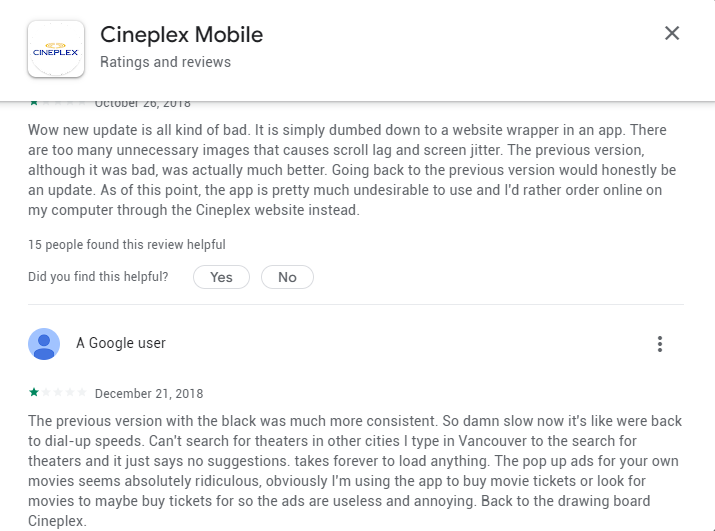
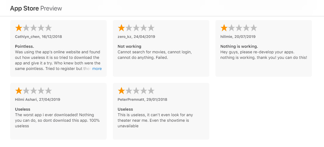
These reviews represent a fraction of the overall feedback. Negative reviews have appeared consistently from 2018 through 2023, indicating issues have not been adequately addressed.
Focus Group
I invited eight participants — former classmates, coworkers, and friends — all with prior experience using the Cineplex app. A remote meeting facilitated open discussion where participants shared their perspectives. The focus group helped identify:
- How users perceive the Cineplex app
- What users believe are the app's most important features
- What problems users experience with the app
- How they would make modifications or improvements
Existing Problems Identified:
- Failure to add cards when attempting to checkout
- Glitches when saving payment methods
- Errors and crashes when booking tickets or logging in/out
- Difficulty locating specific movies due to a messy movie list
- Poor navigation — high loading times, tickets failing to load
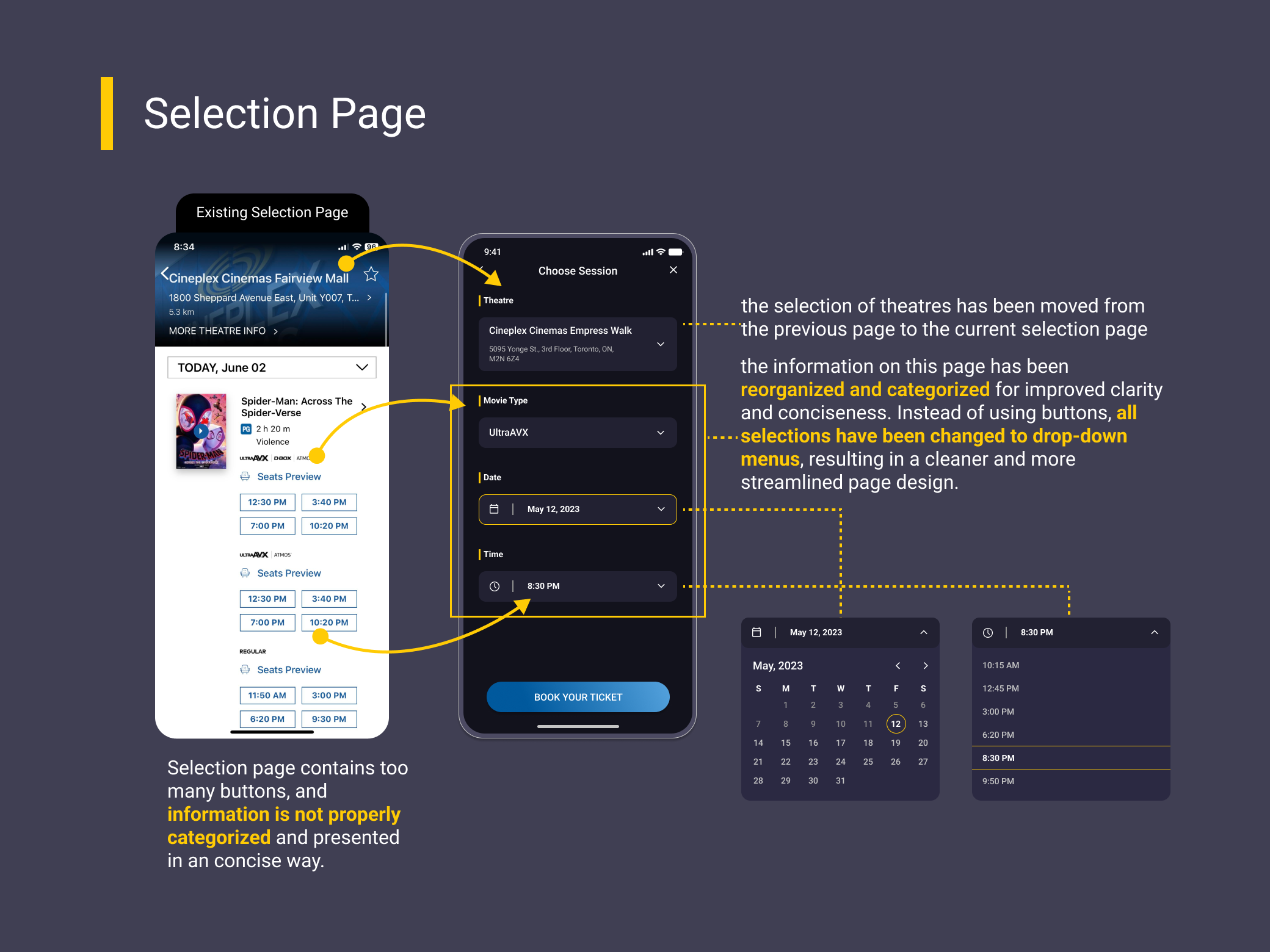
- Seat selection getting stuck frequently
- Inconsistent UI across certain pages
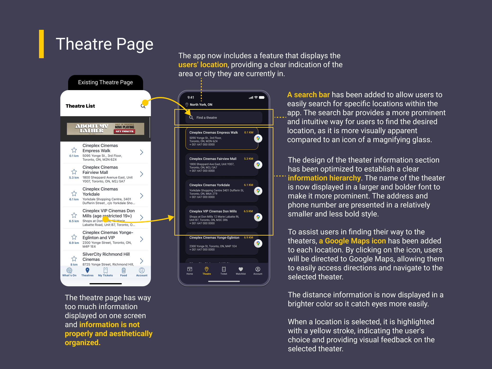
- Location not saving, all theatres showing up when booking
- Accepted tickets not appearing after confirmation
Navigation, user flows, and modification of current features would be the primary focus of this project.
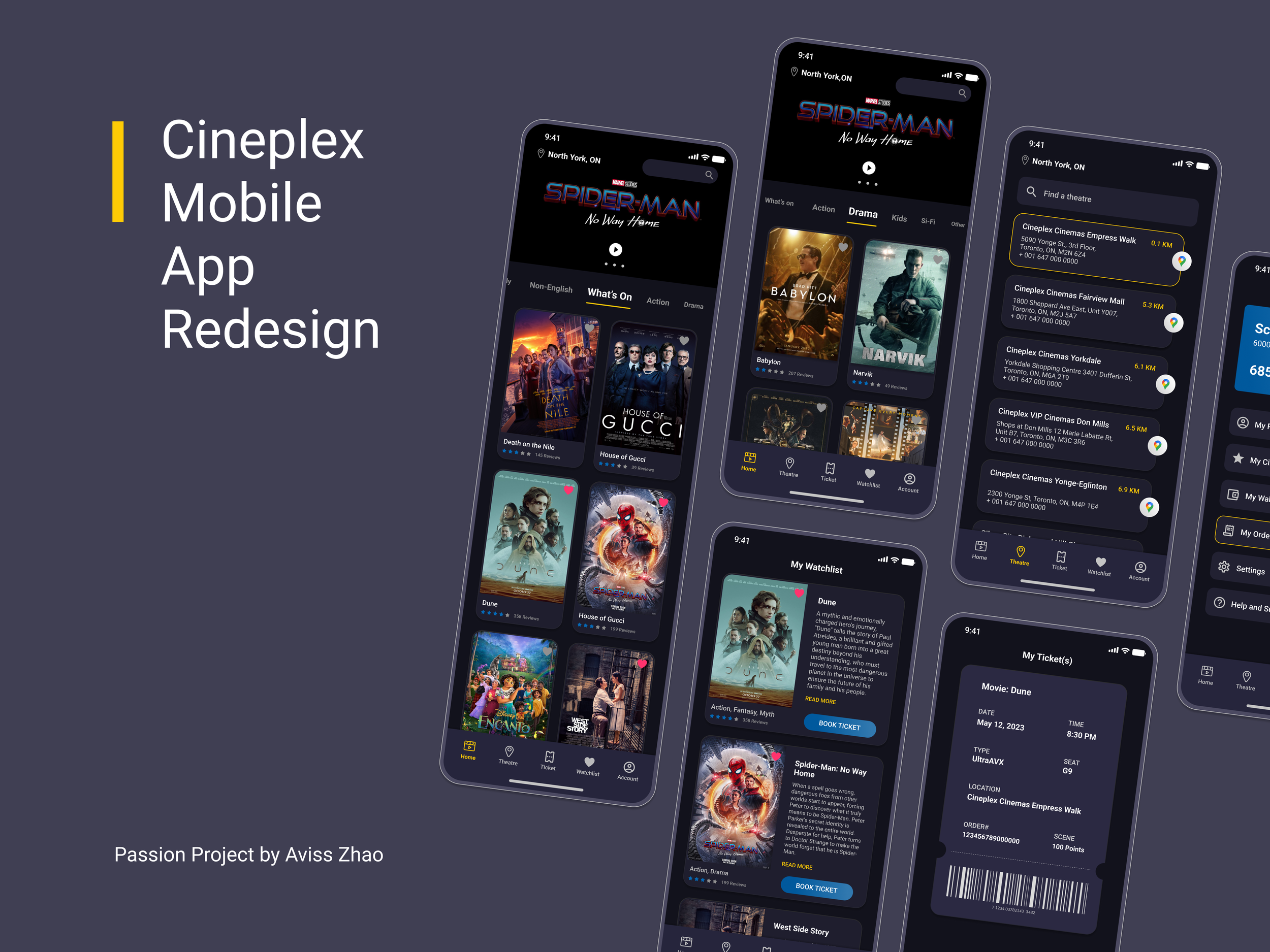
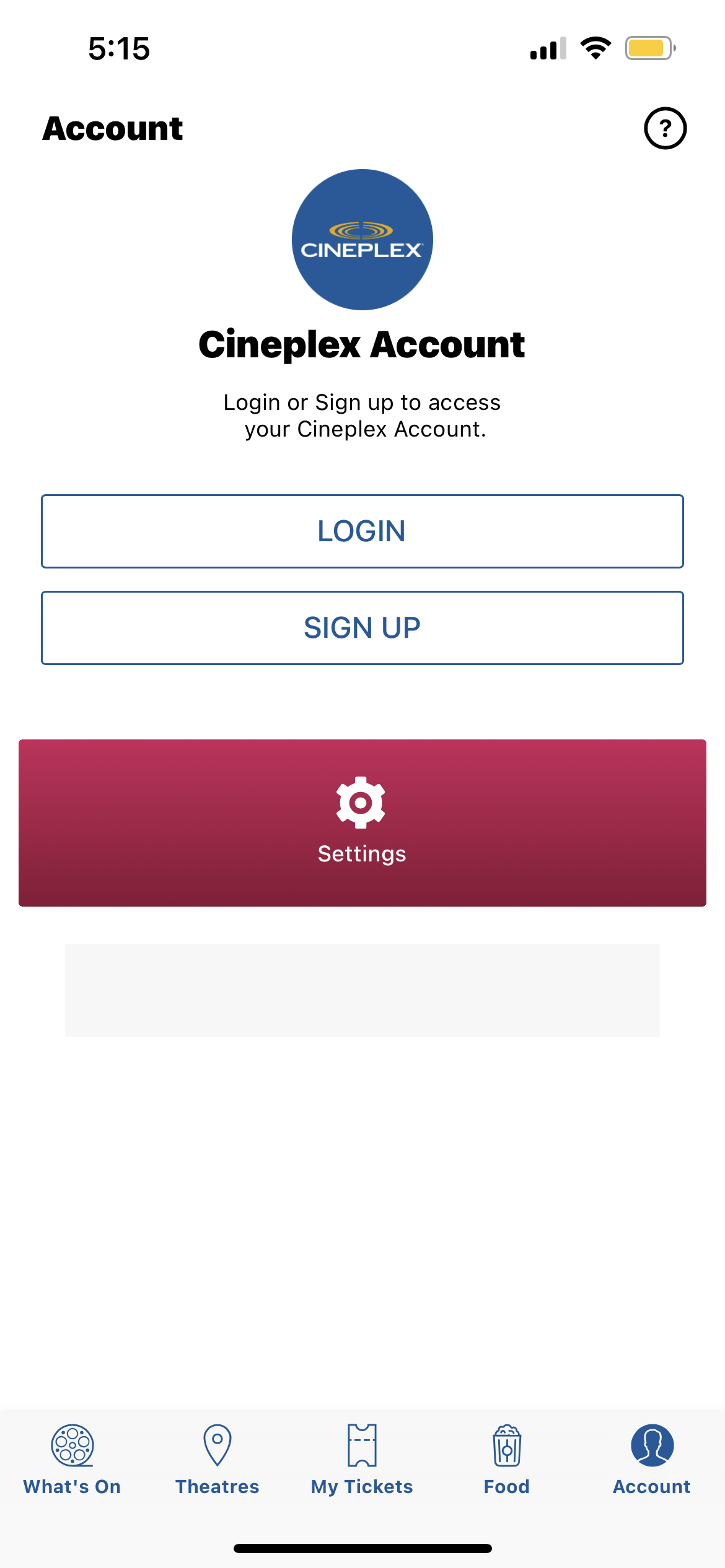
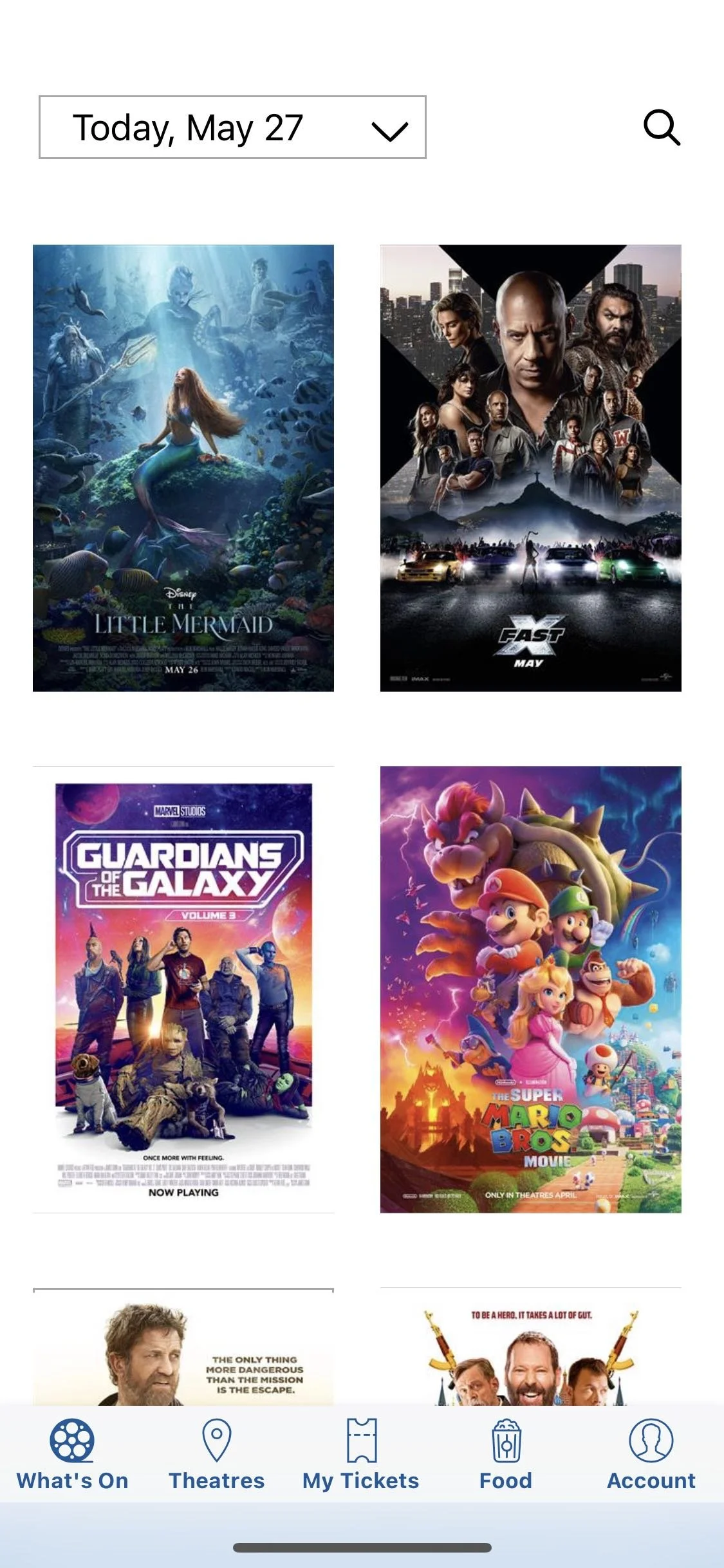
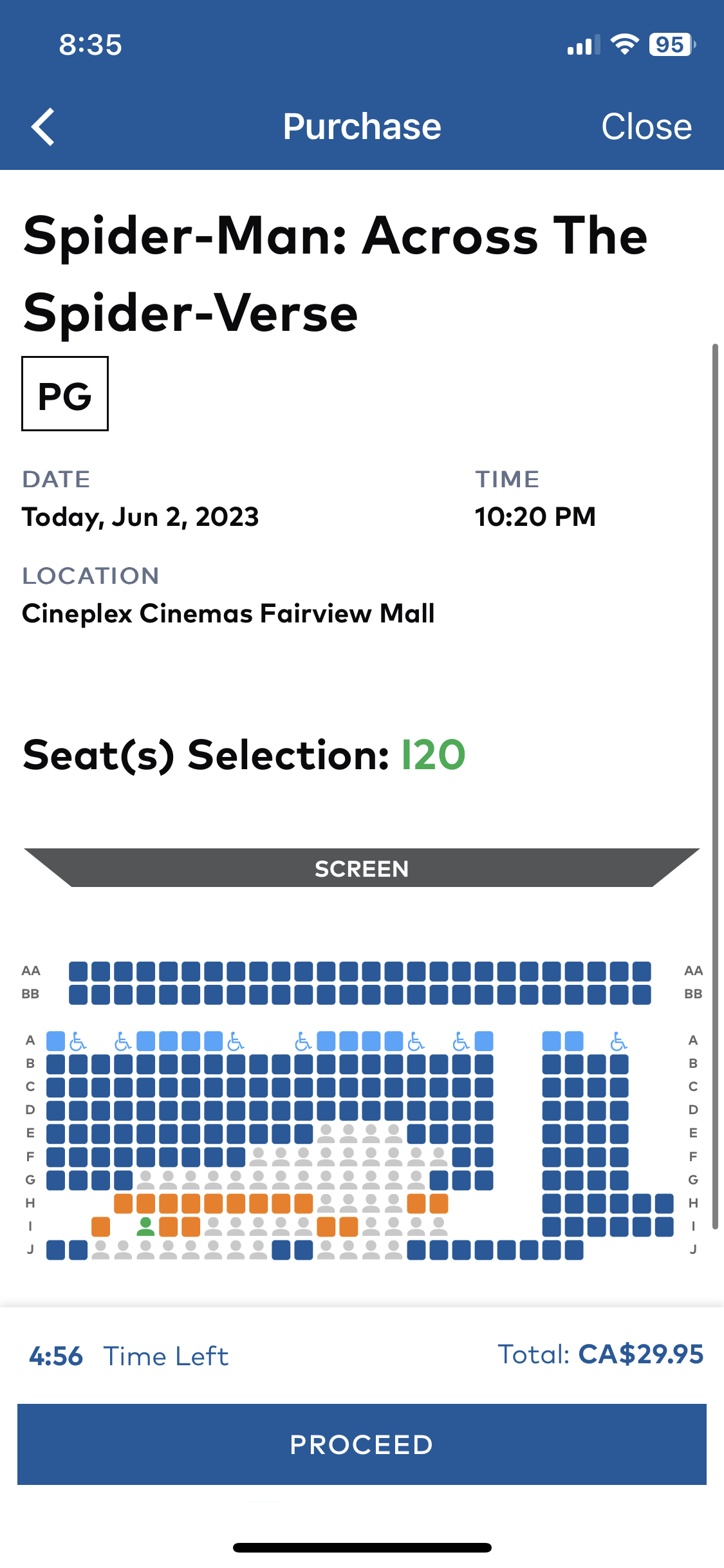
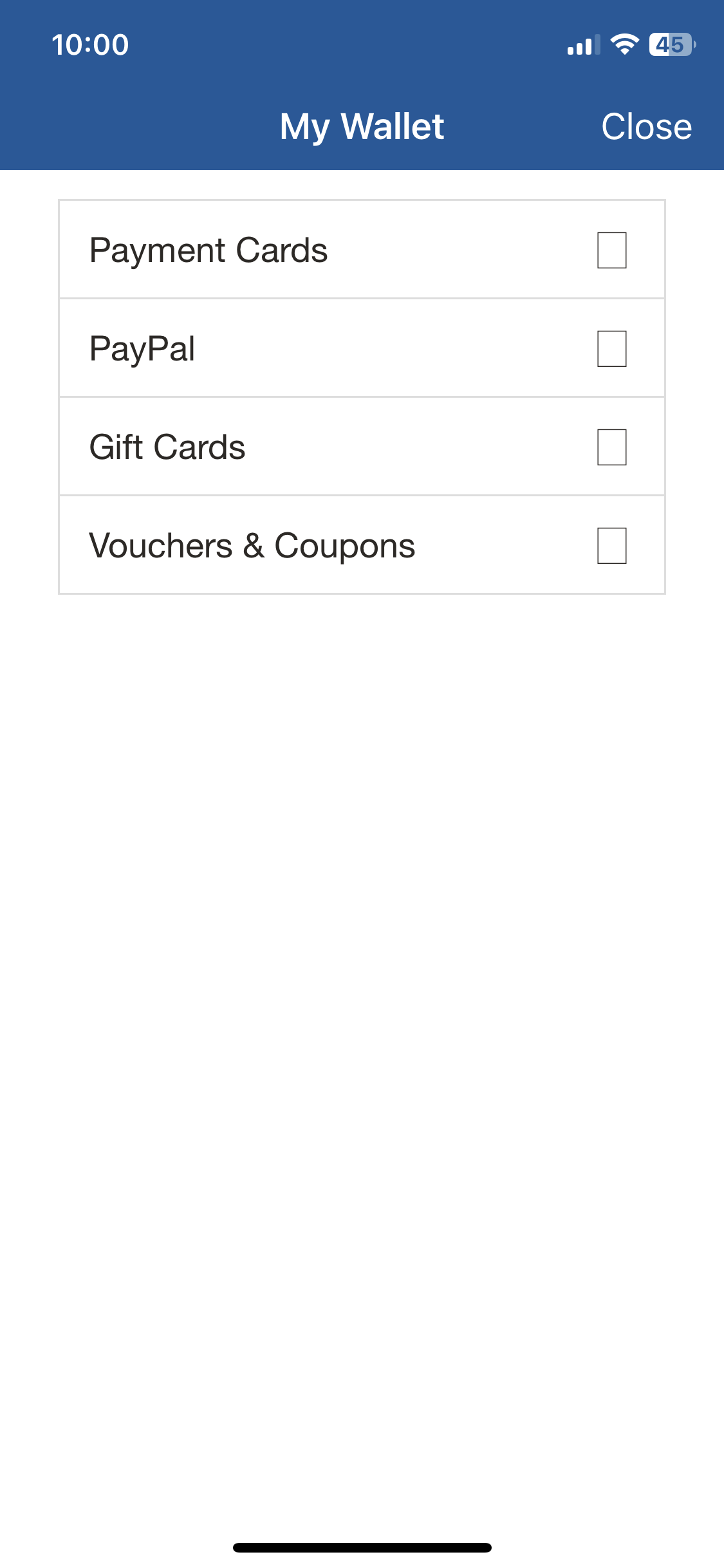
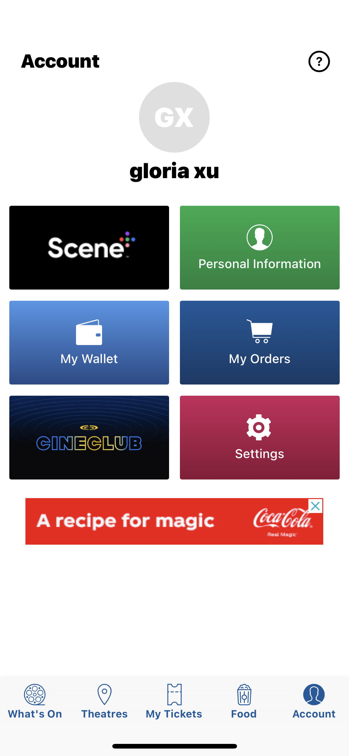
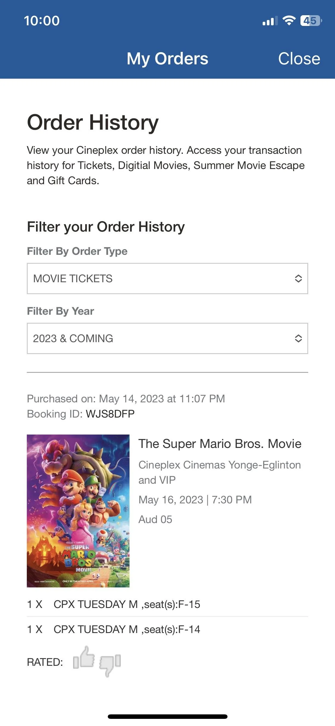
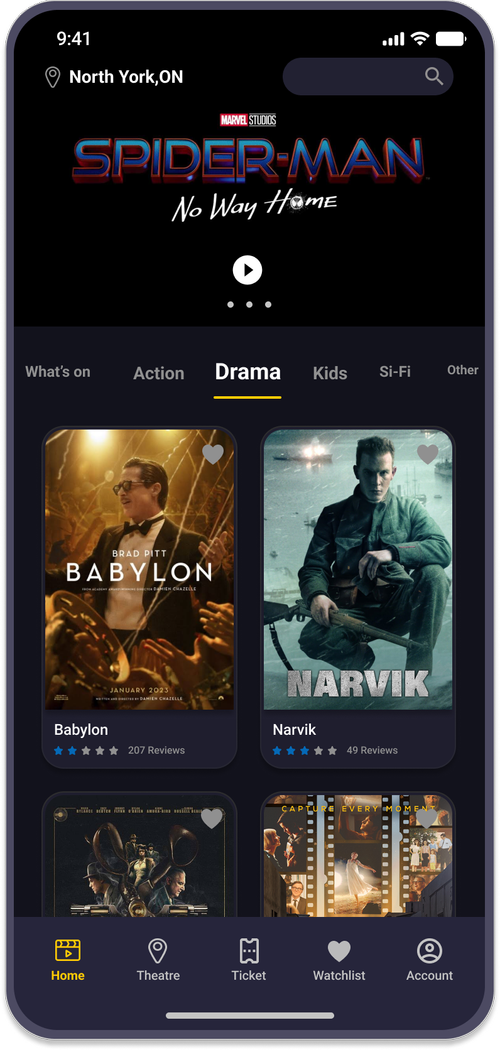
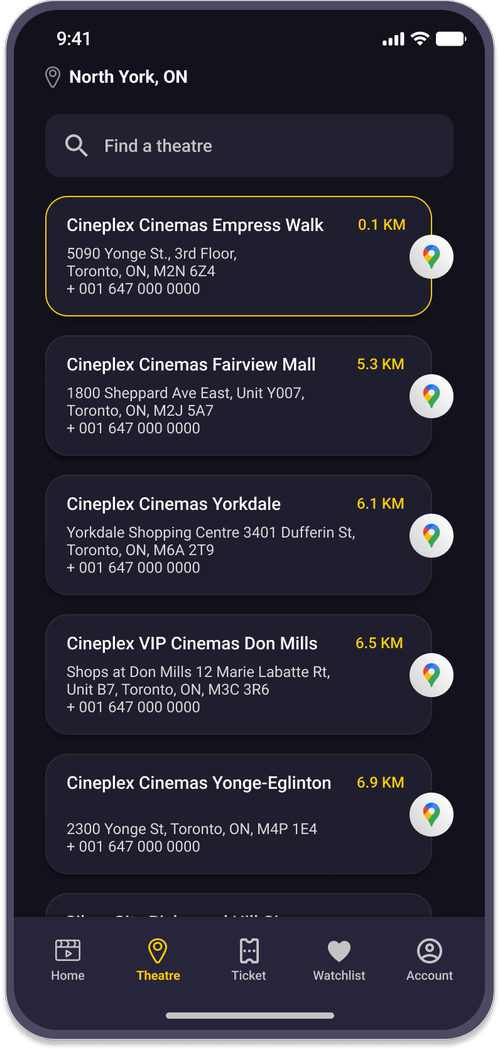
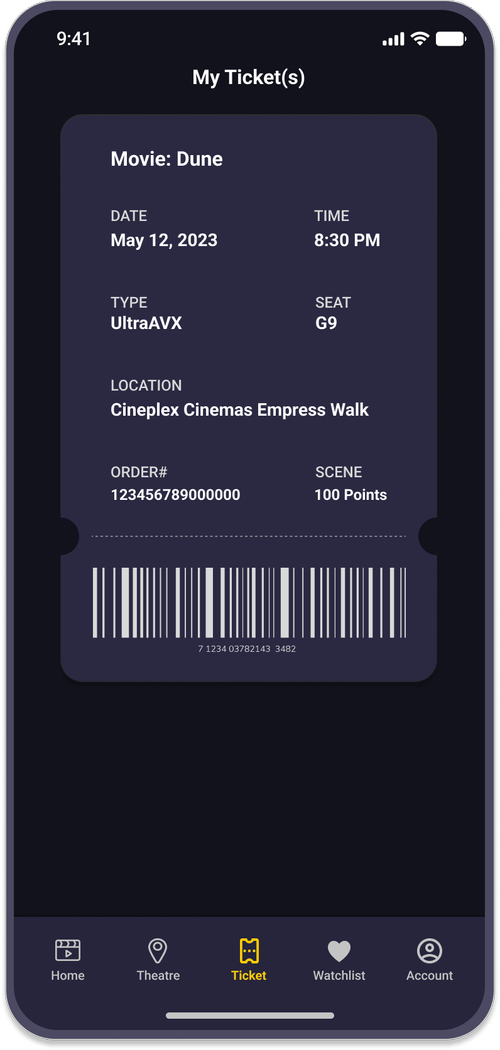
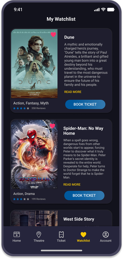
Existing App
An overview of the current Cineplex app screens that have been redesigned as part of this case study:
Redesign Process
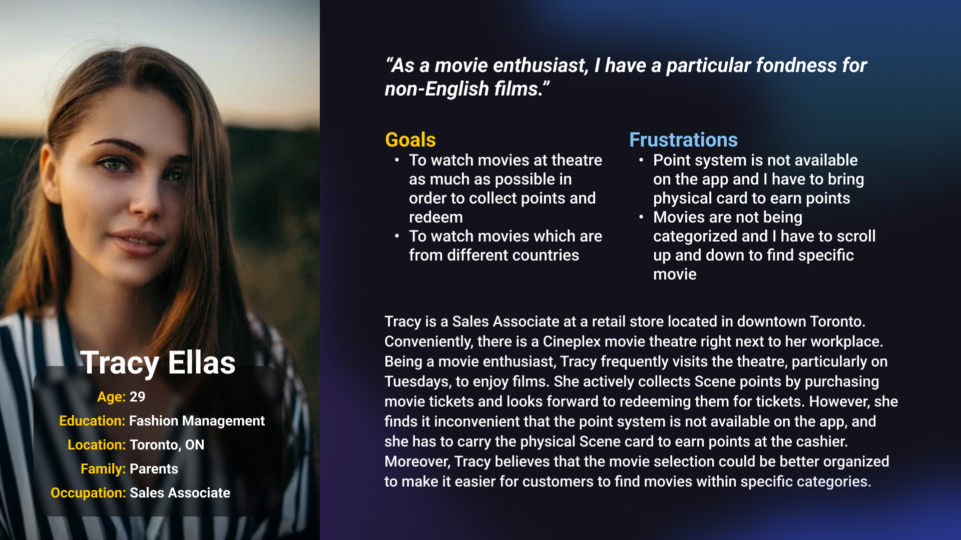
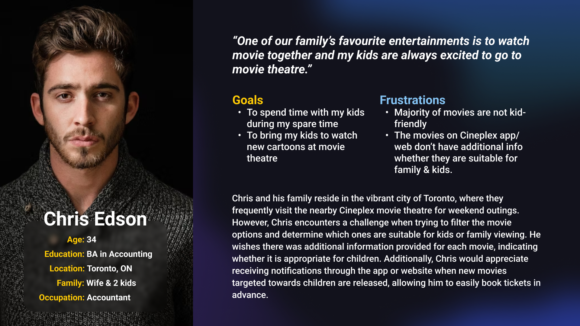
User Personas
User personas represent fictitious characters based on the real target audience, helping to identify user needs and desires and making the redesign process more focused.
Information Architecture
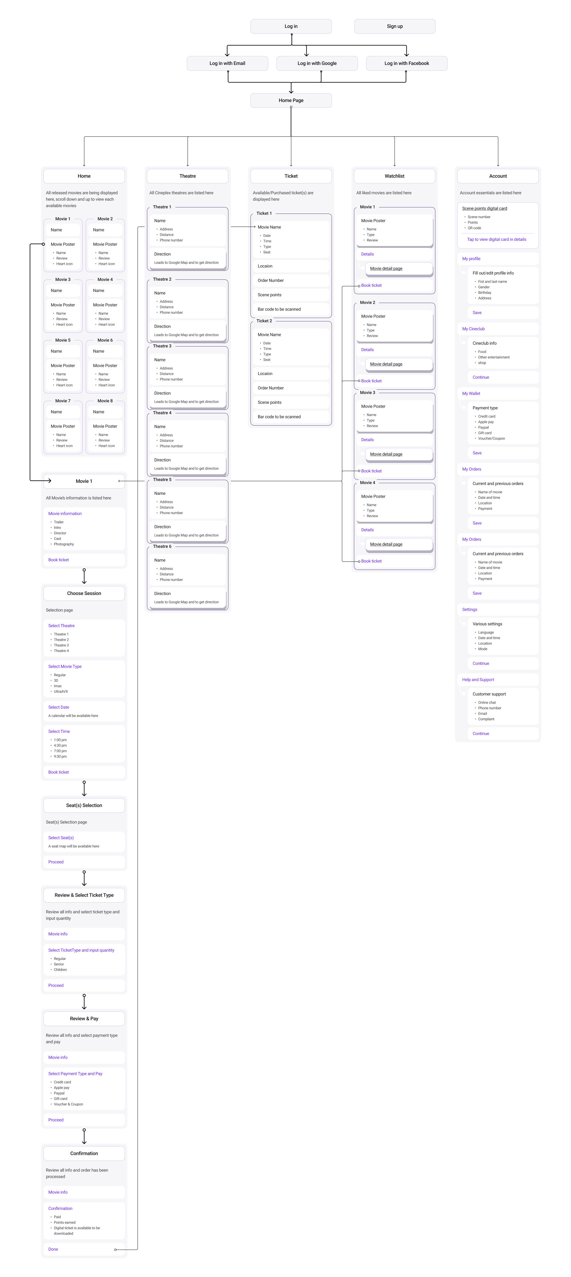
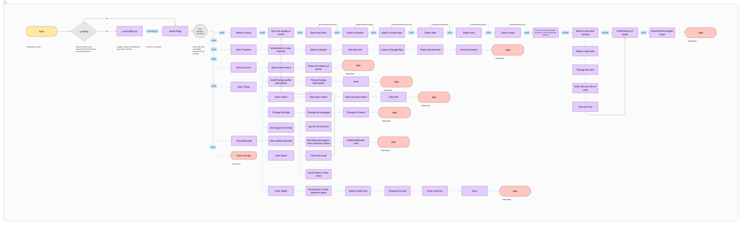
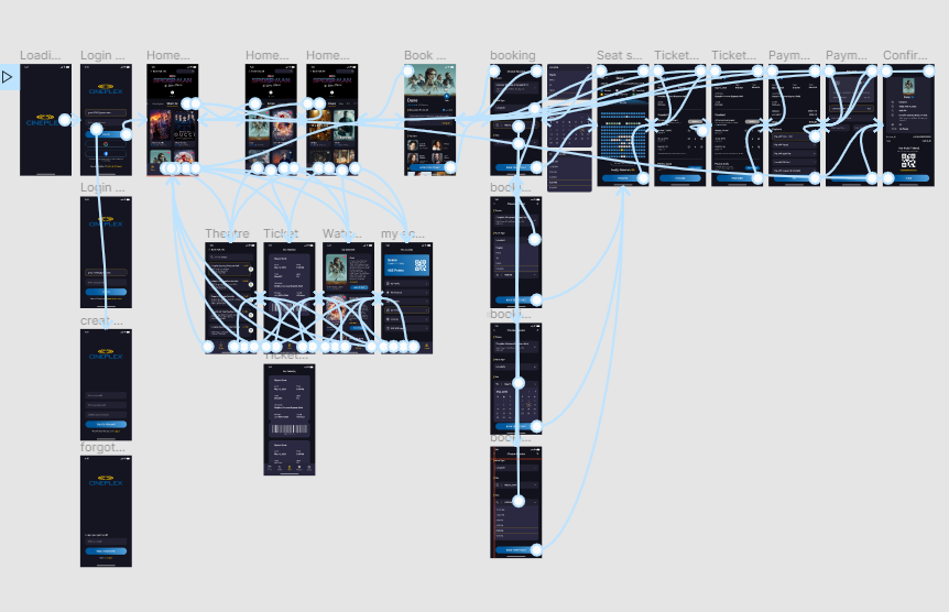
User Flow
Creating a user flow maps out the series of steps a user takes to accomplish a specific task within the app — helping identify how users navigate and whether the design meets their needs.
Low-Fidelity Wireframes
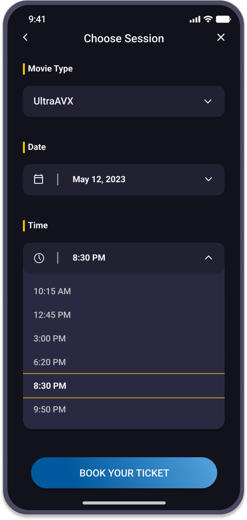
The home page holds a crucial role within the app — the primary objective is the ticket checkout process. Modifications focus on improving information organization, architecture, and overall user flow.
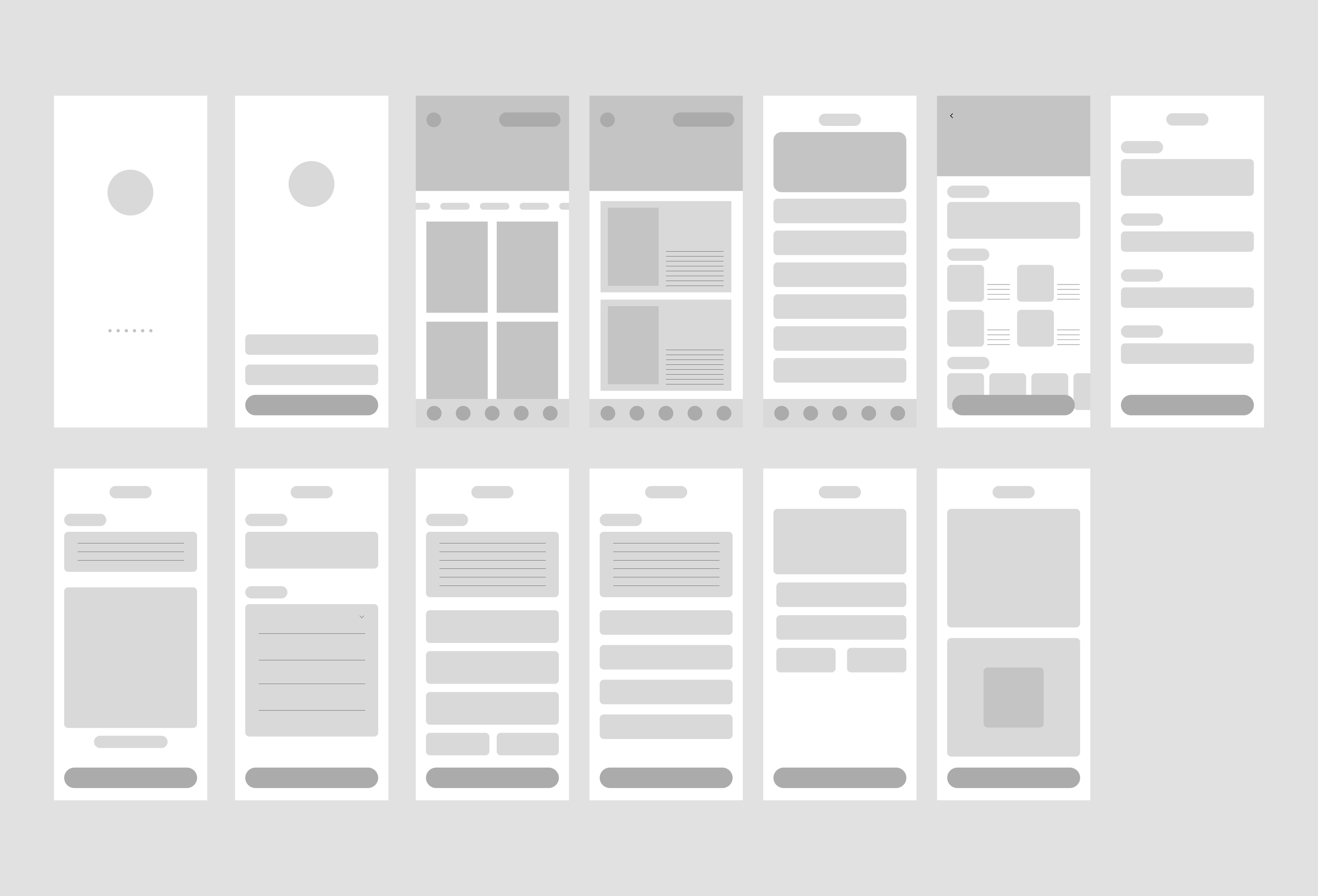
First version of wireframe
Second version of wireframe indicating feature names
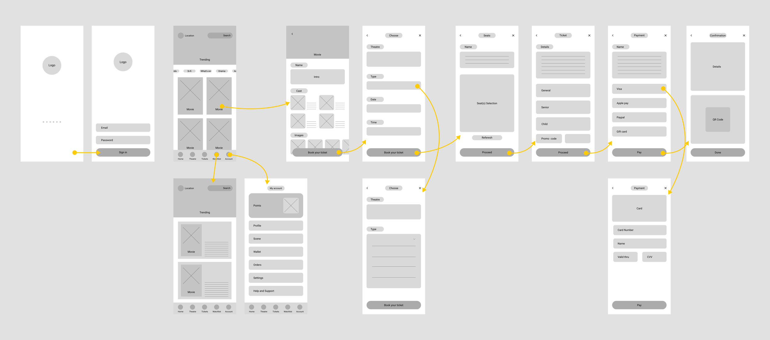
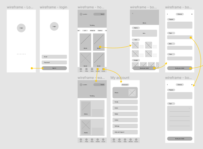
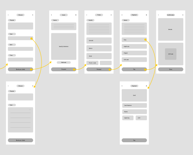
Navigation / user flow
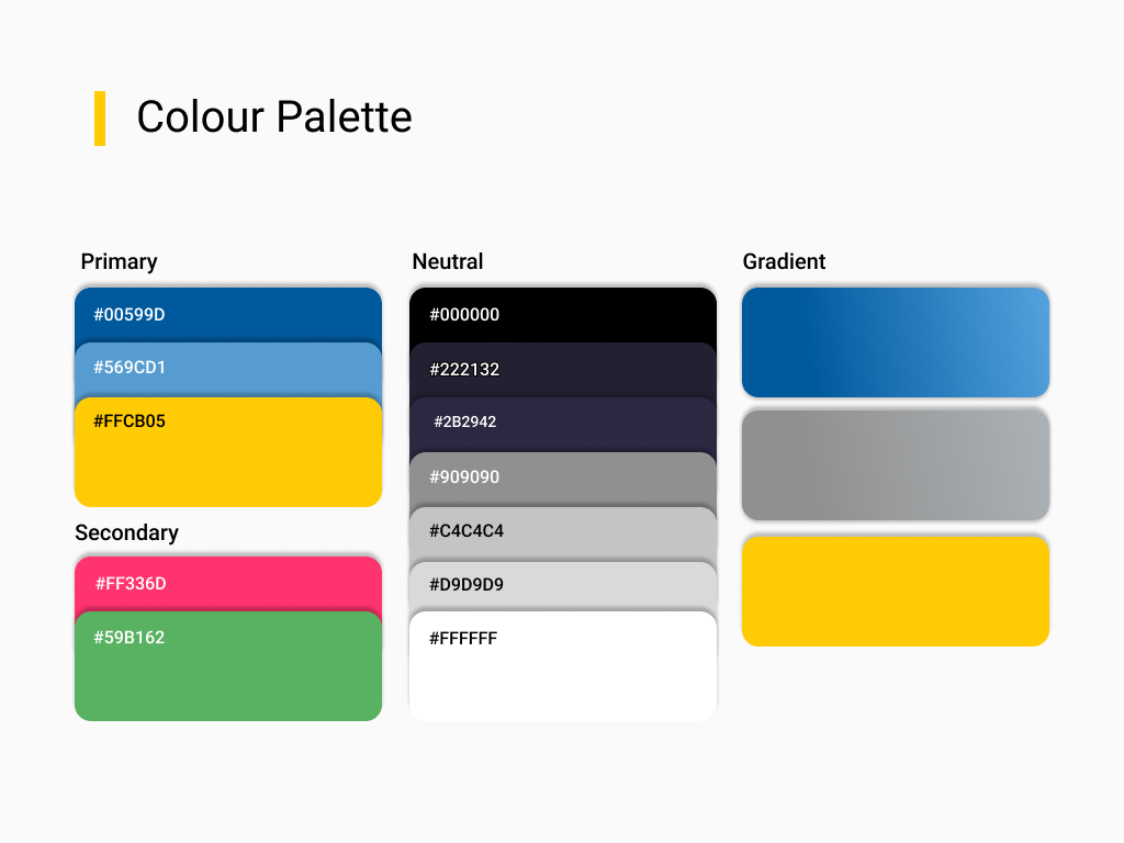
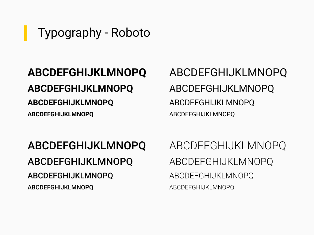
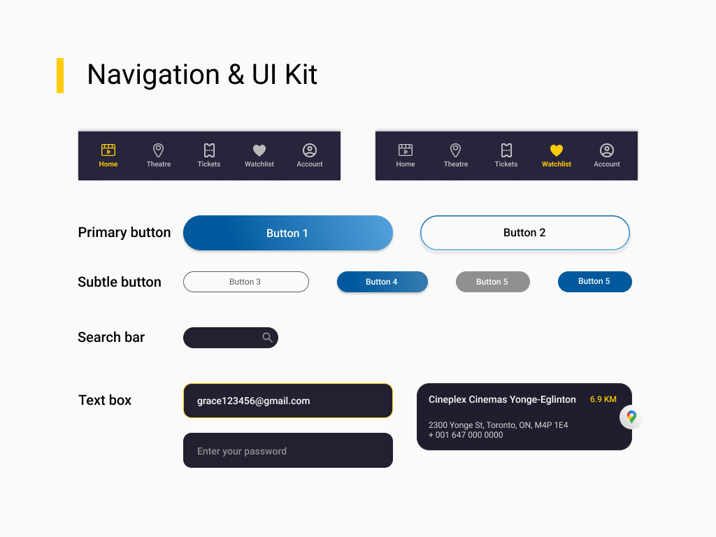
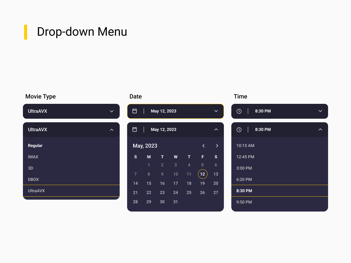
Brand Guideline / Design System
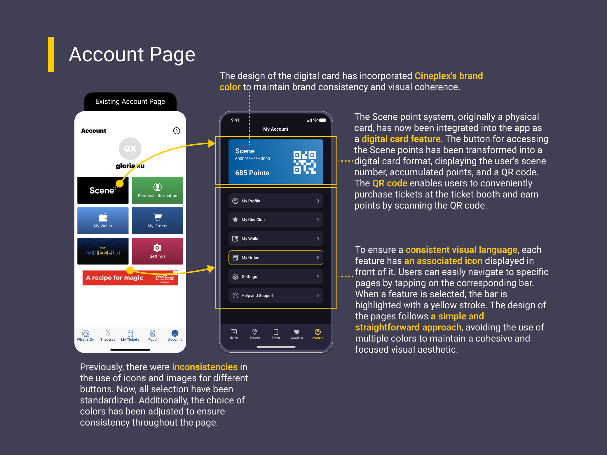
Aligned with Cineplex's brand guidelines — logos and main colors (yellow and blue) — I added a few new colors. While the app recently adopted light mode, I chose dark mode to enhance the ambiance of a movie theatre.
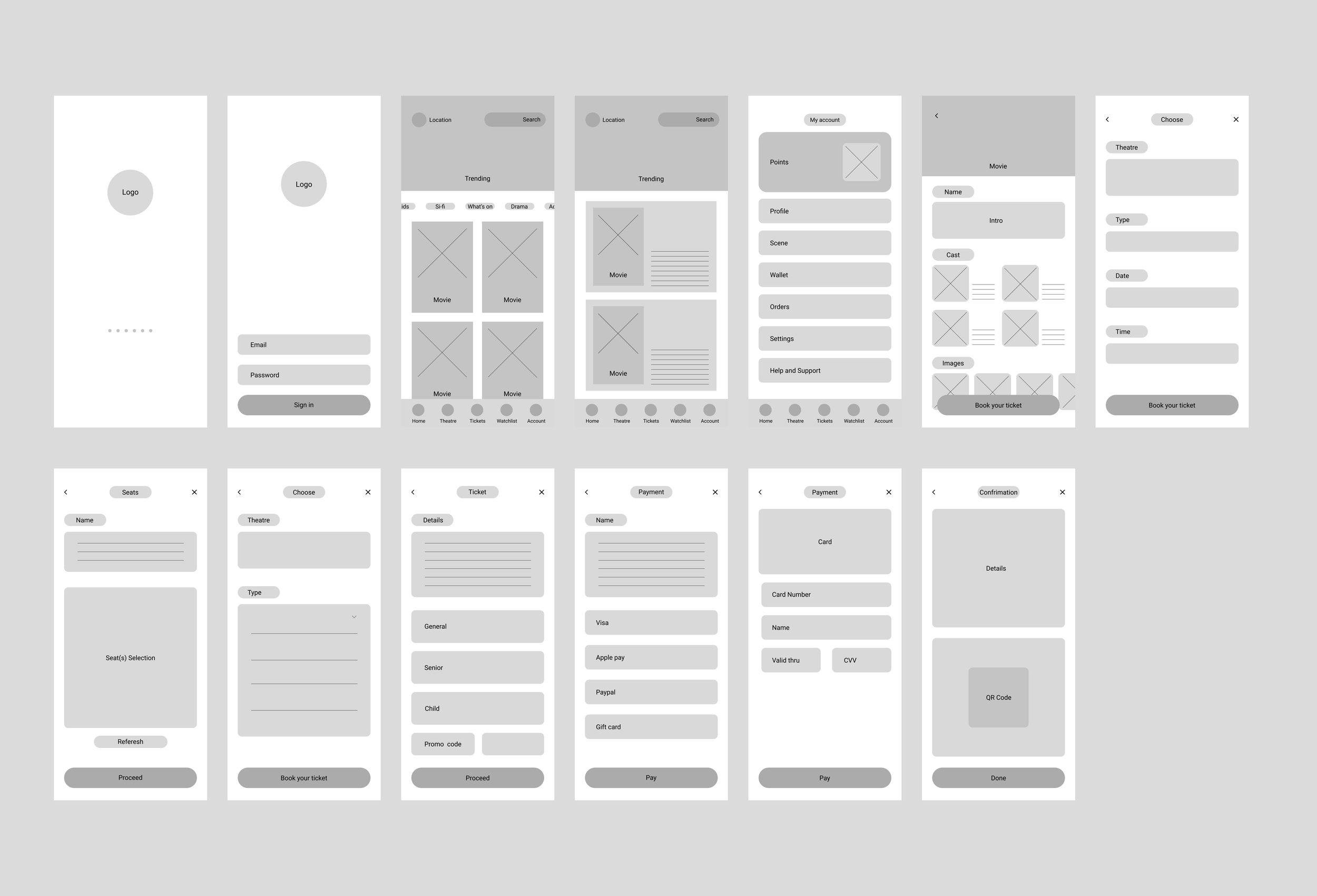
High-Fidelity UI Design
Sticking with Cineplex's brand colours of blue and yellow, with additional colors and dark mode:
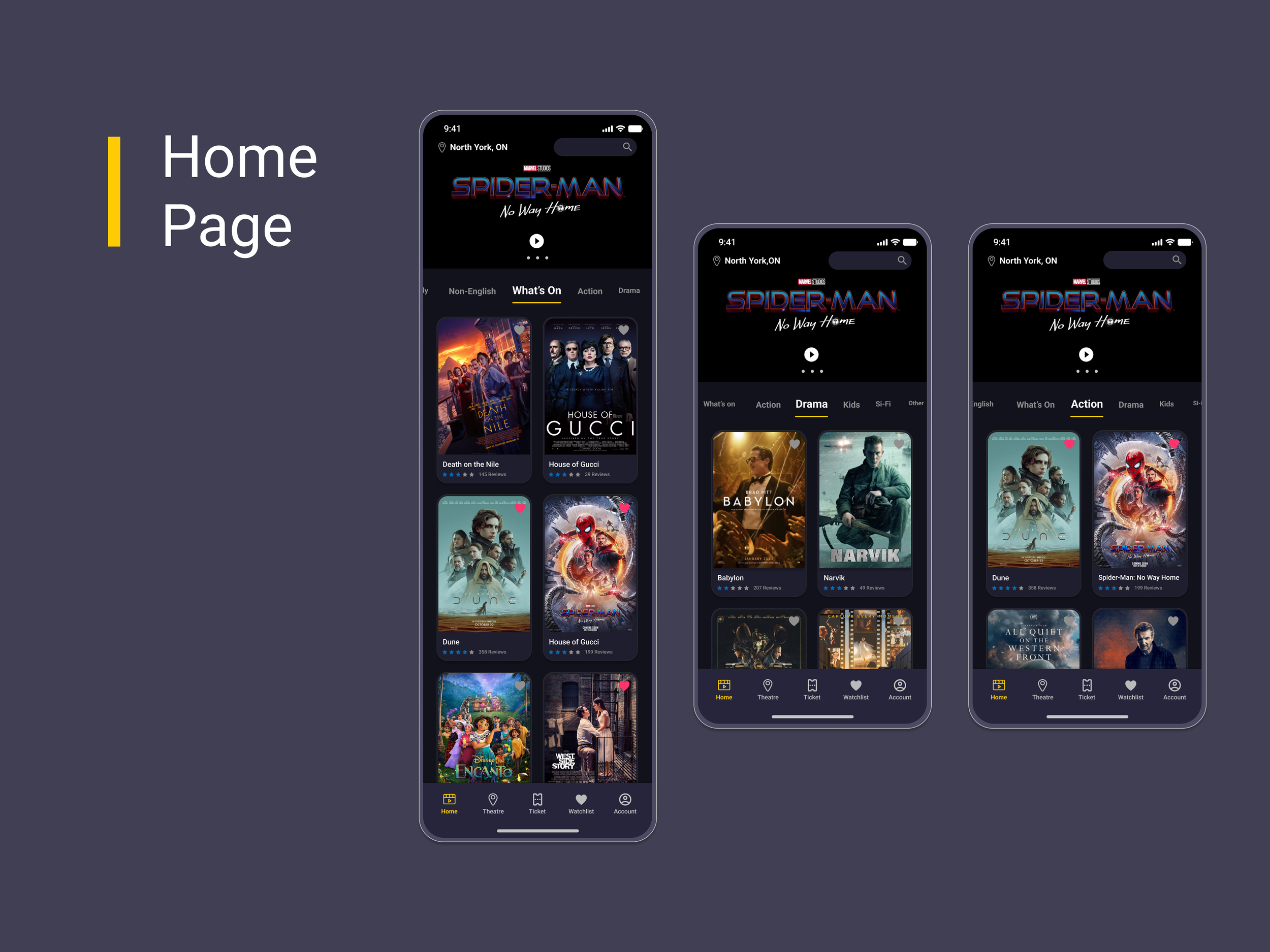
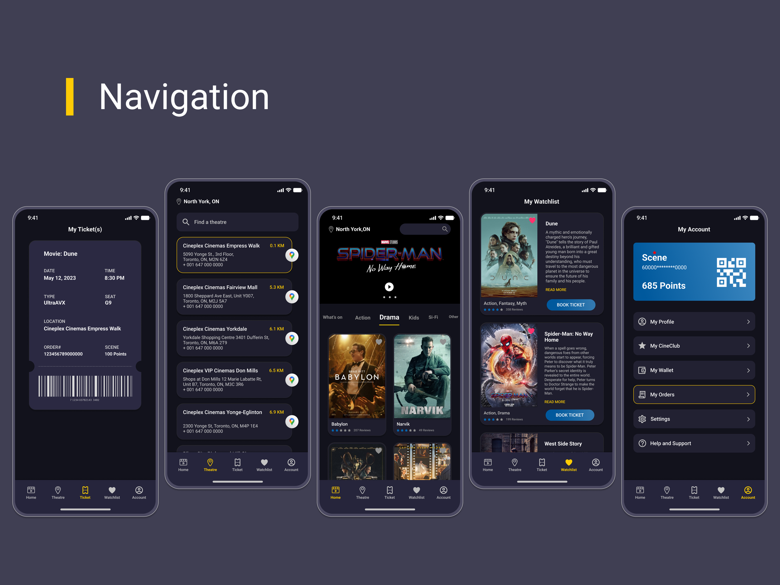
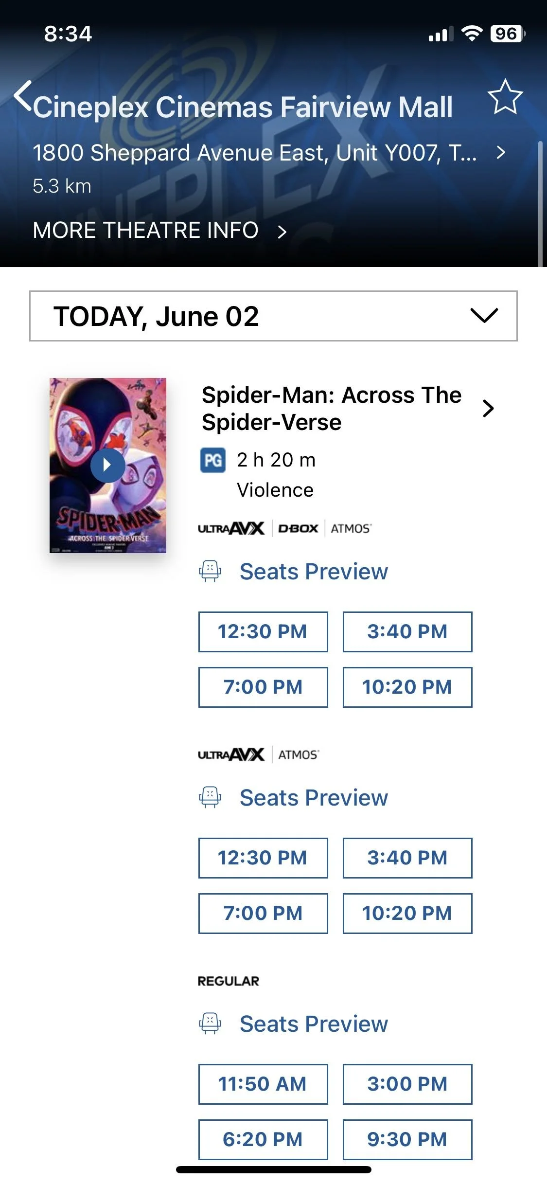
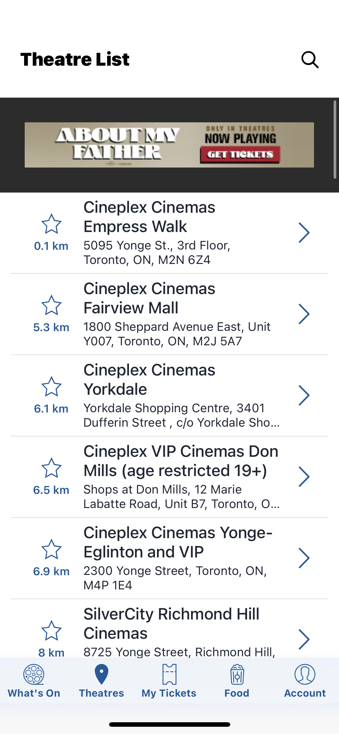
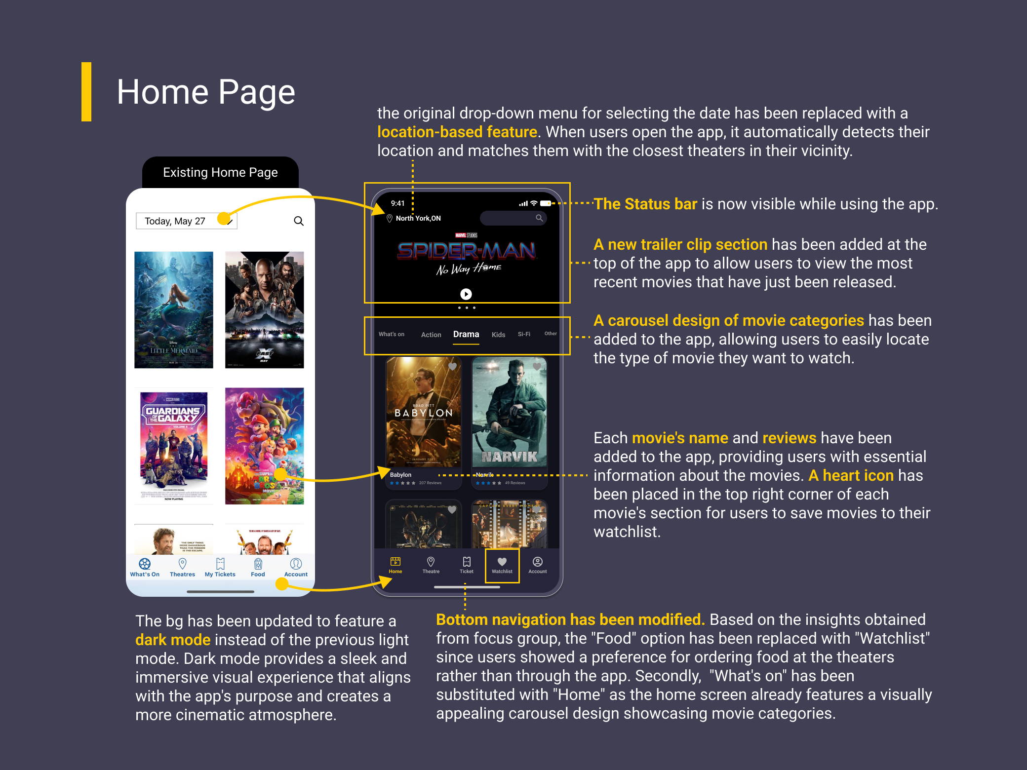
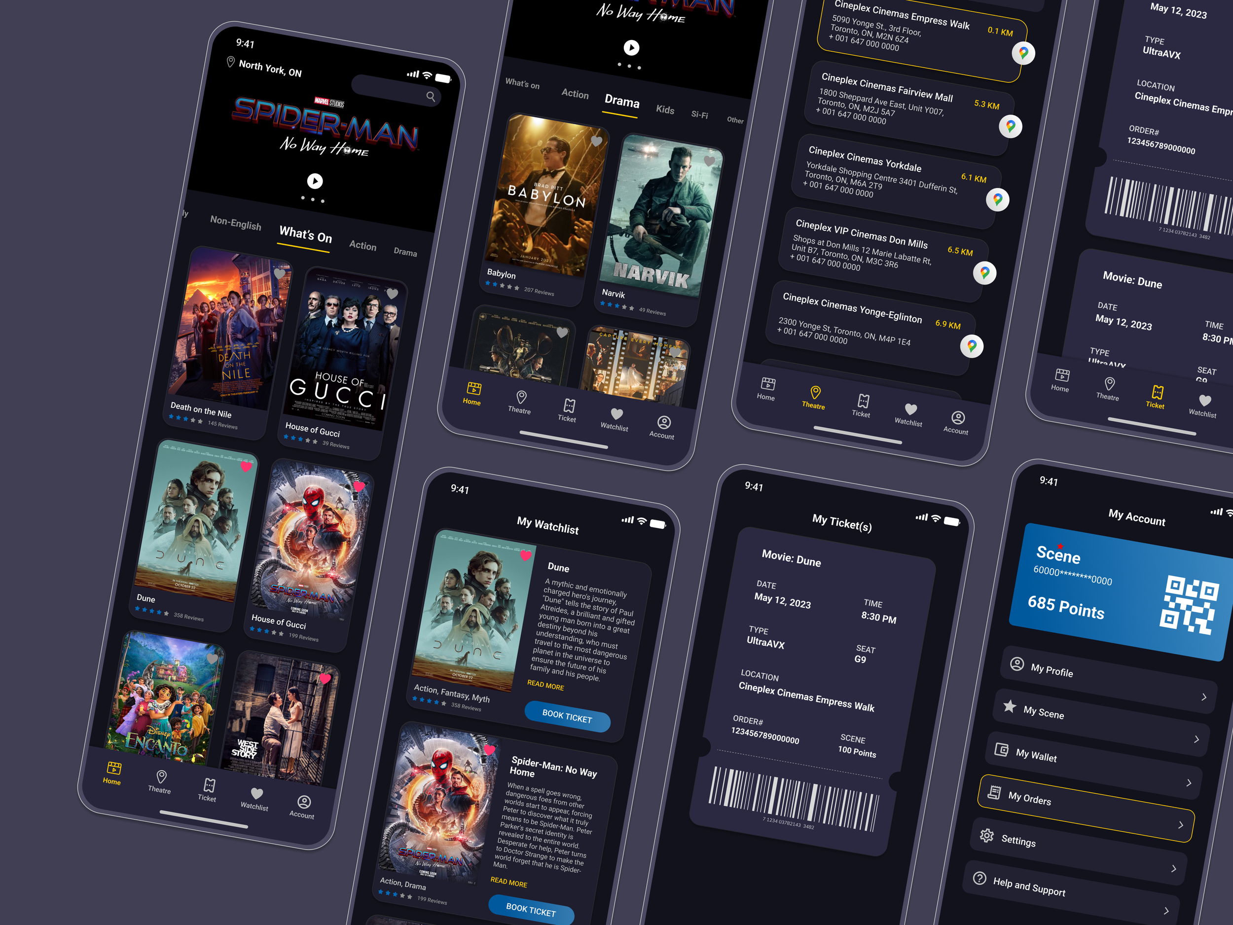
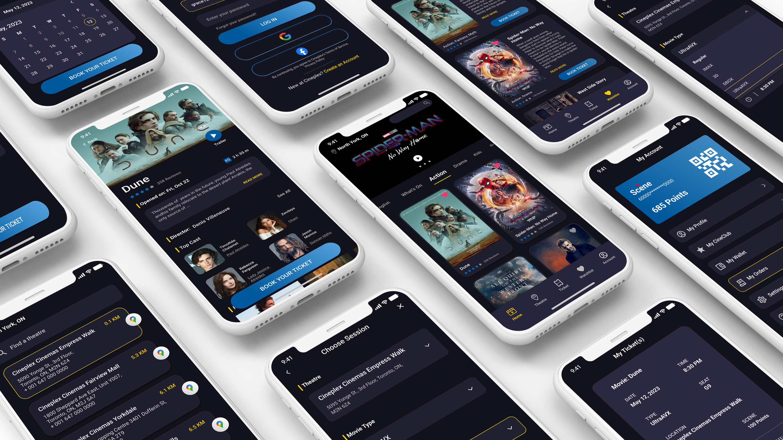
Navigation Screens
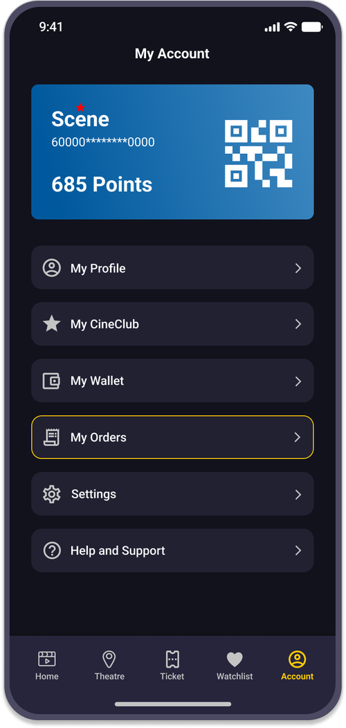
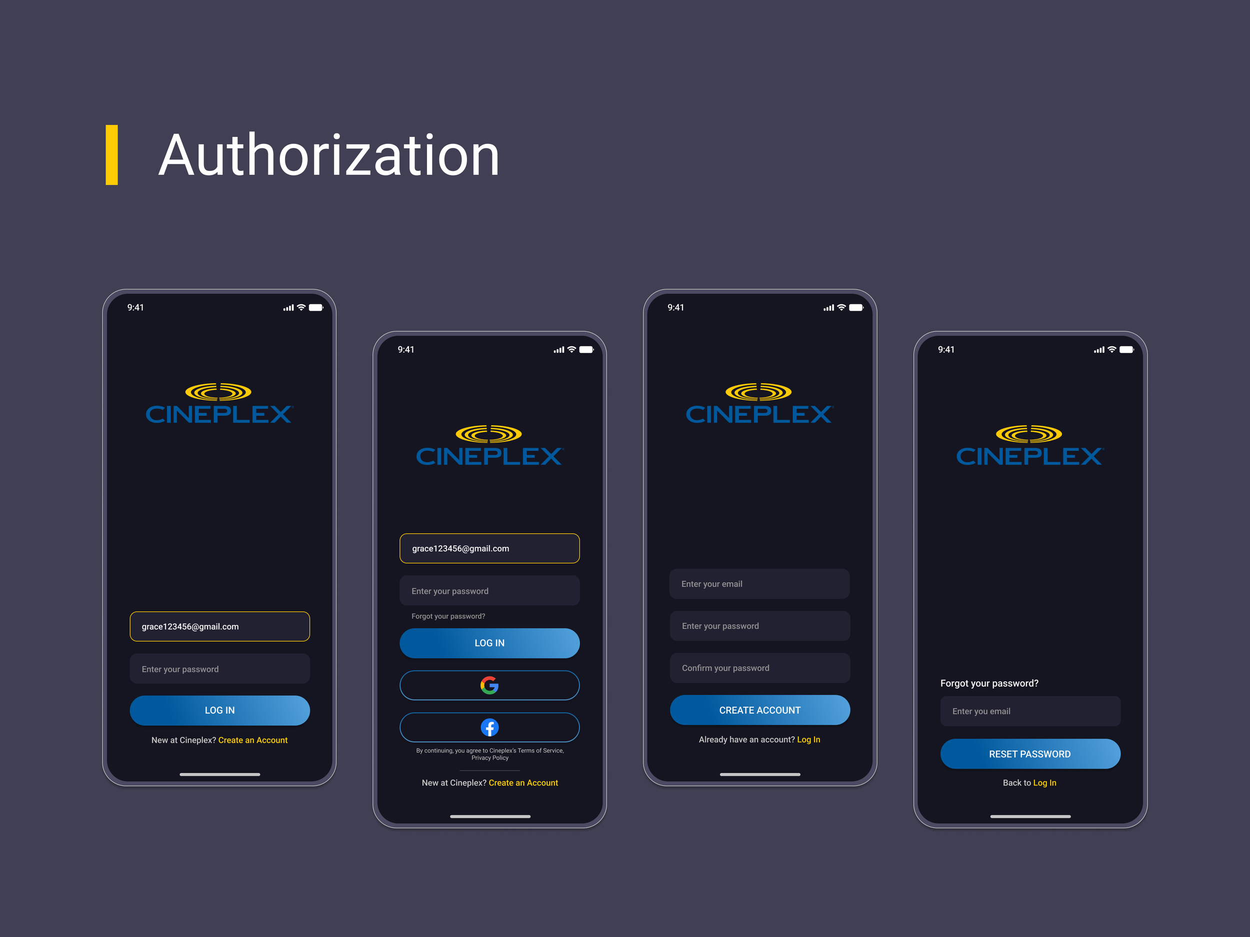
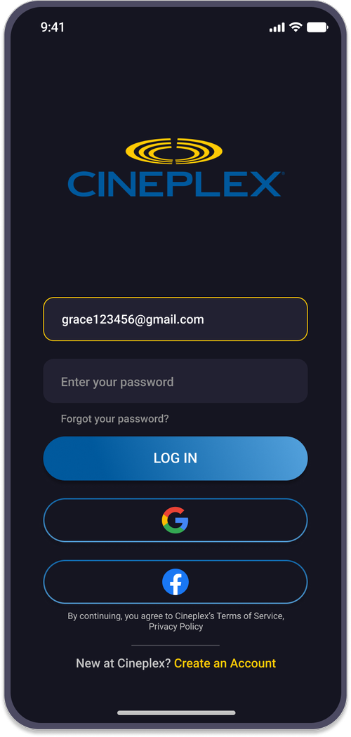
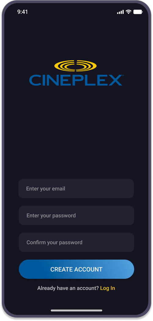
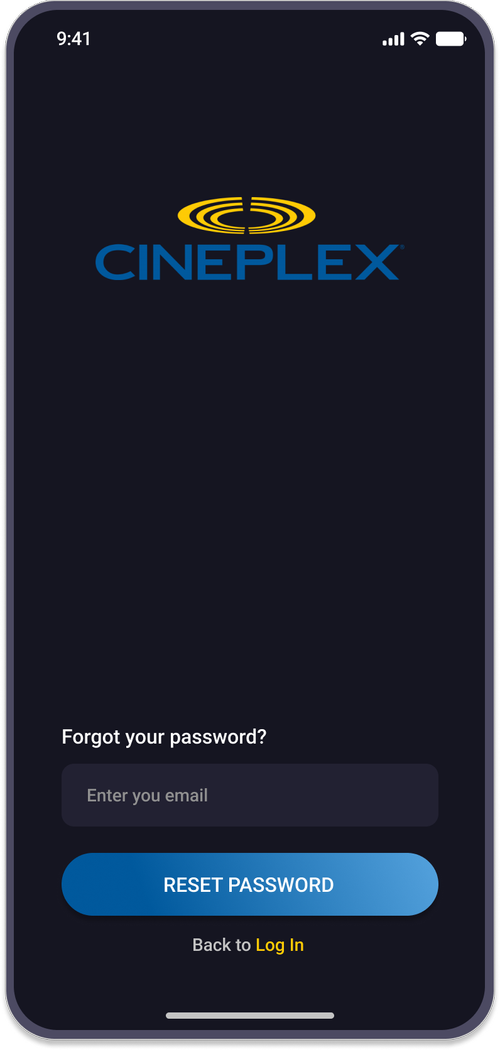
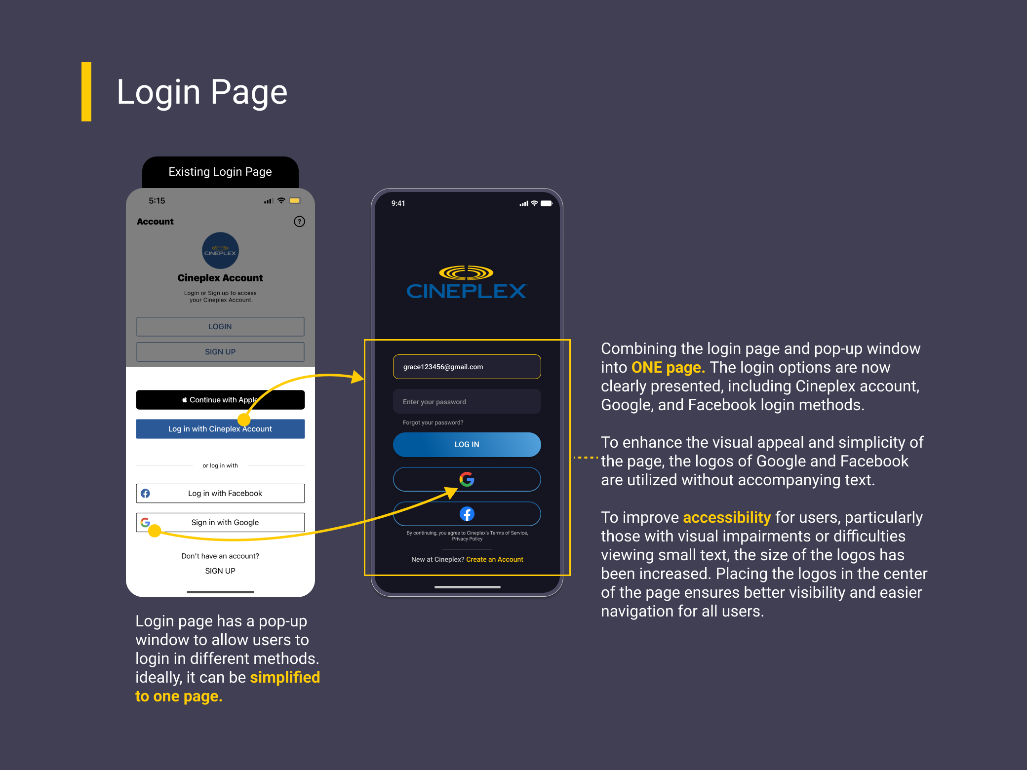
Authorization Screens
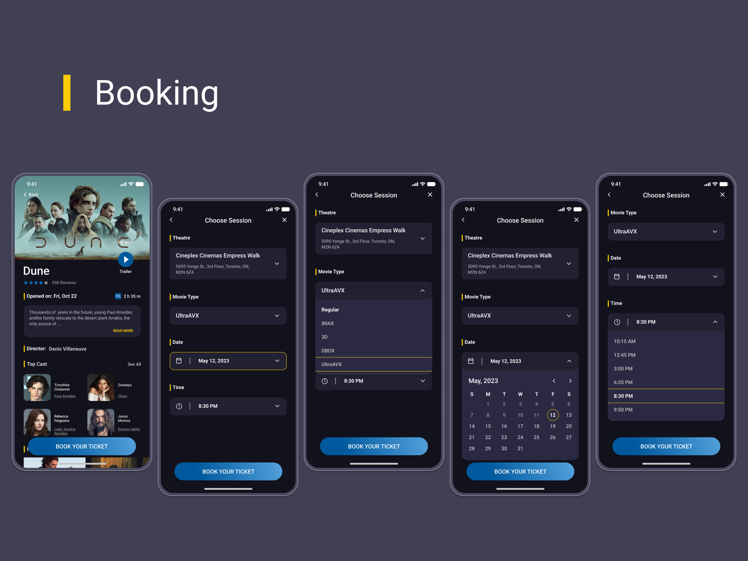
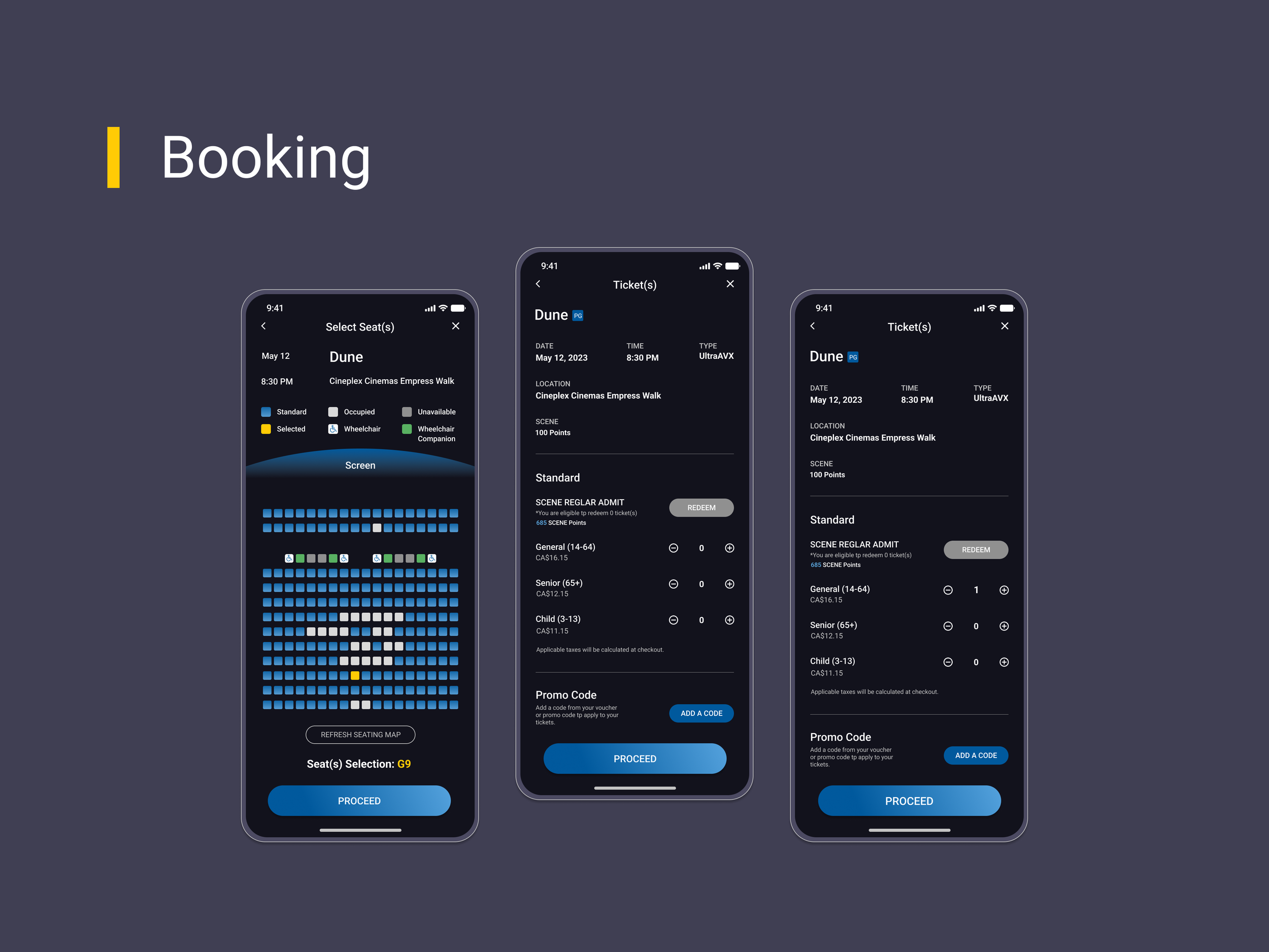
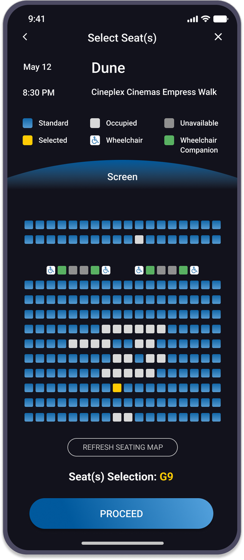
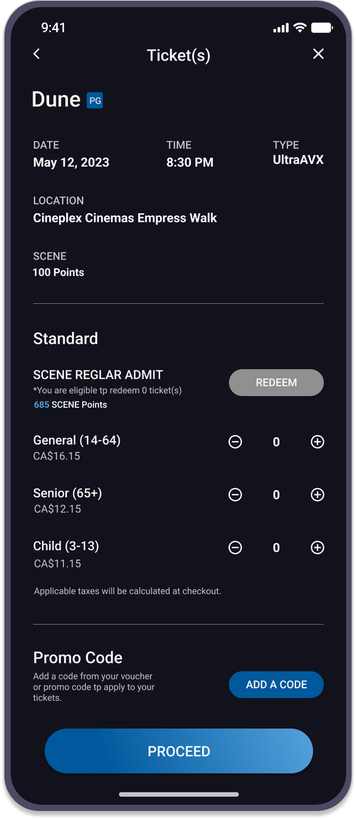
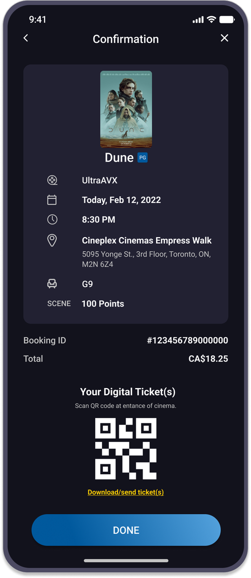
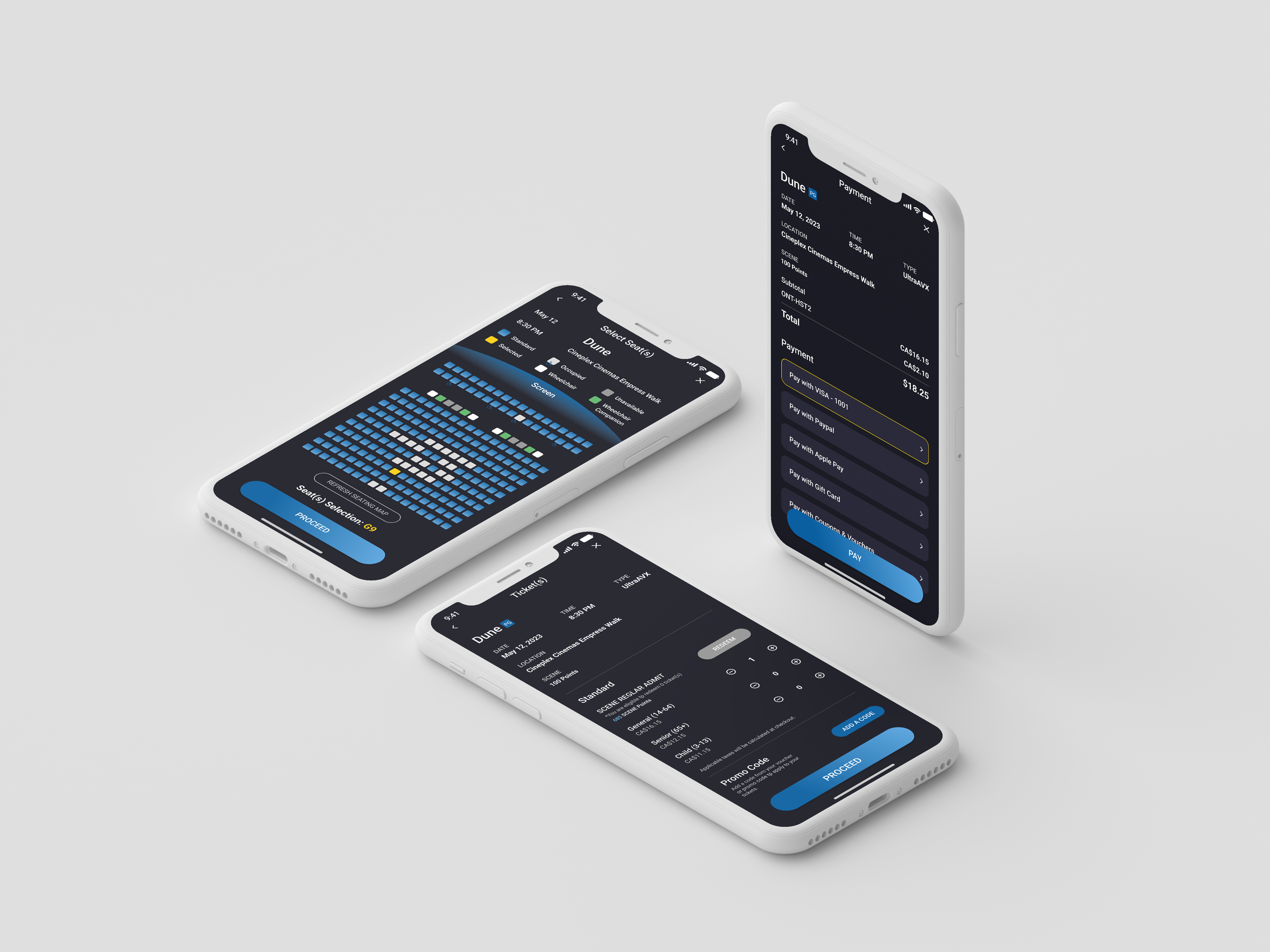
Booking Screens
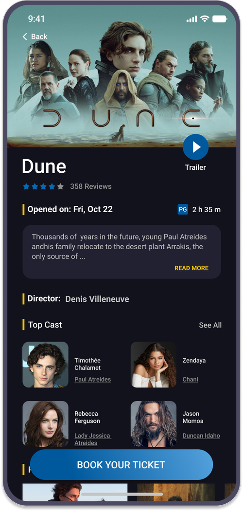
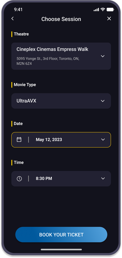
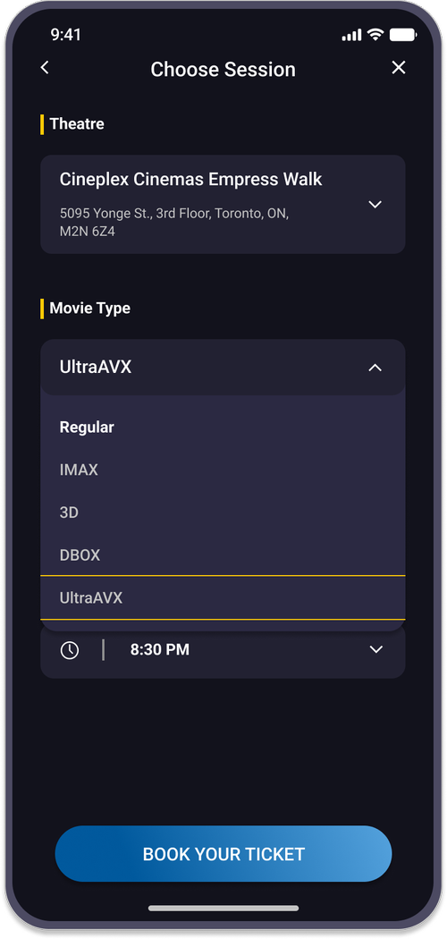
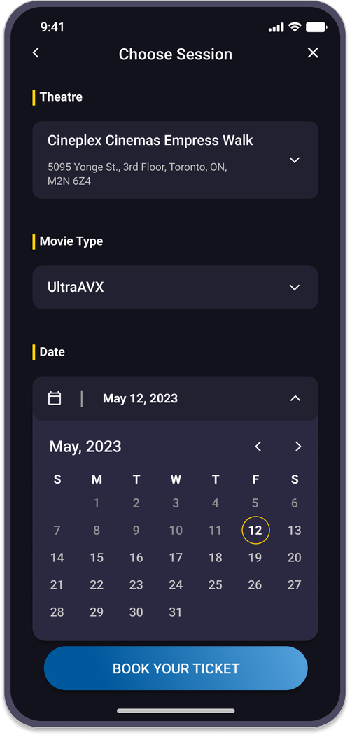

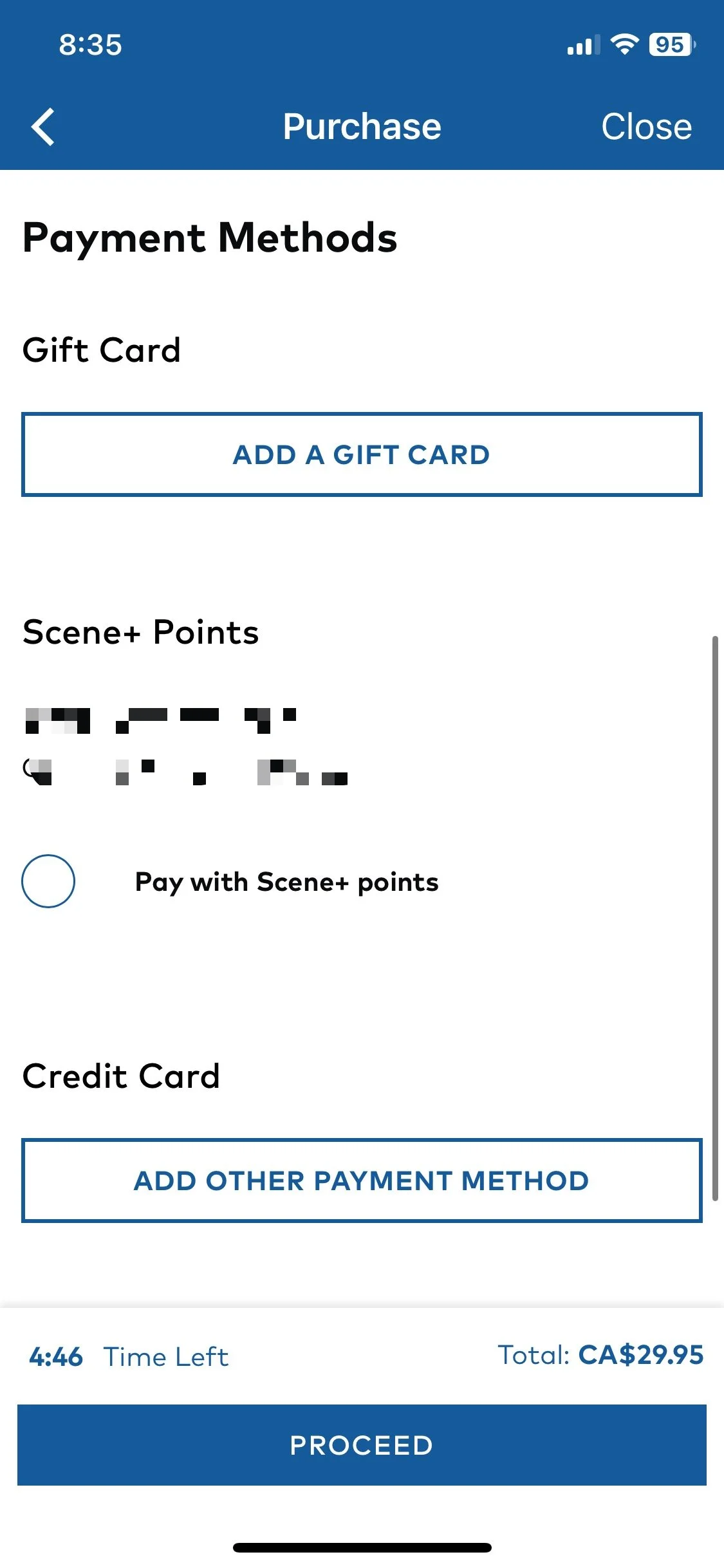
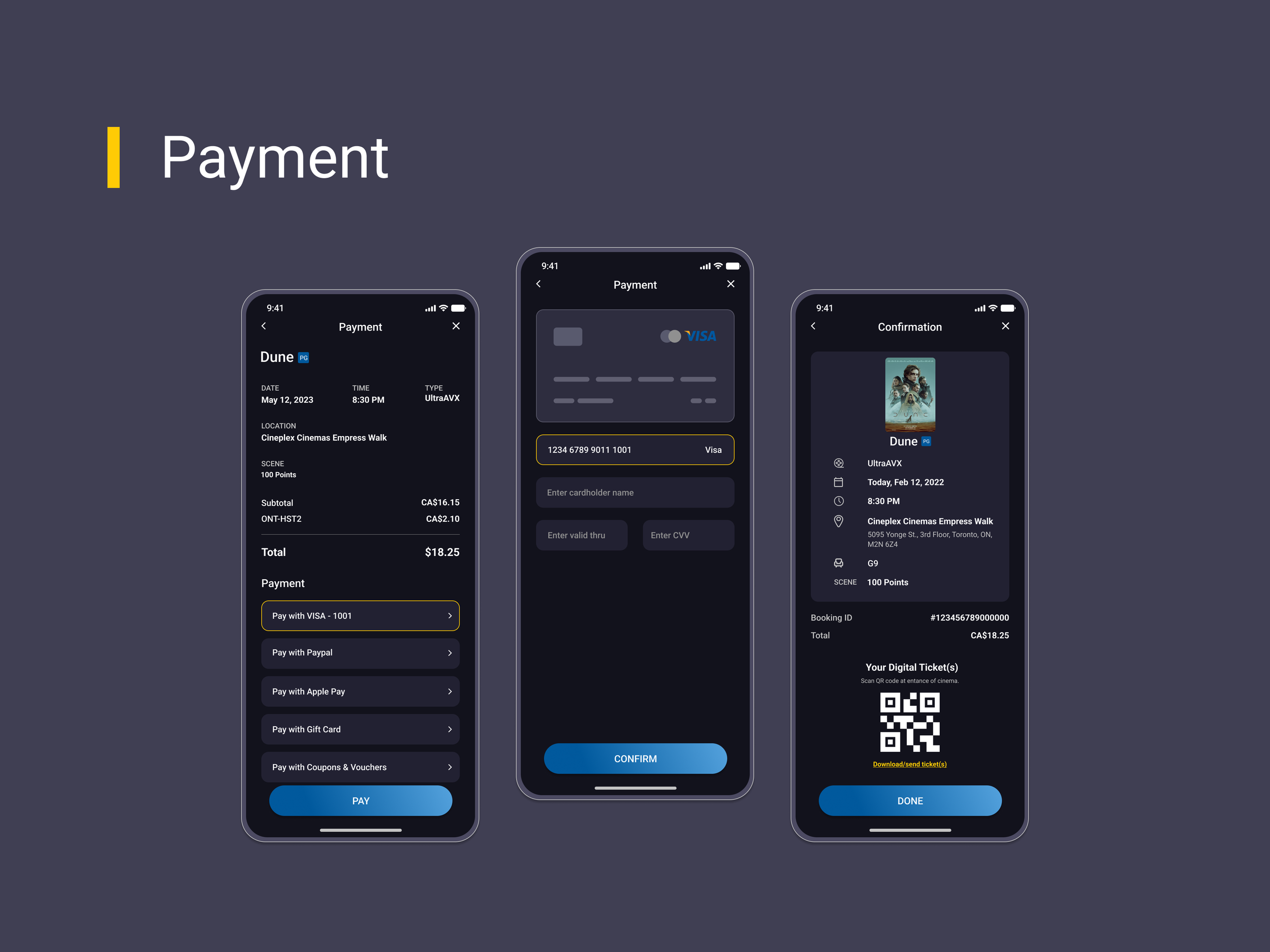
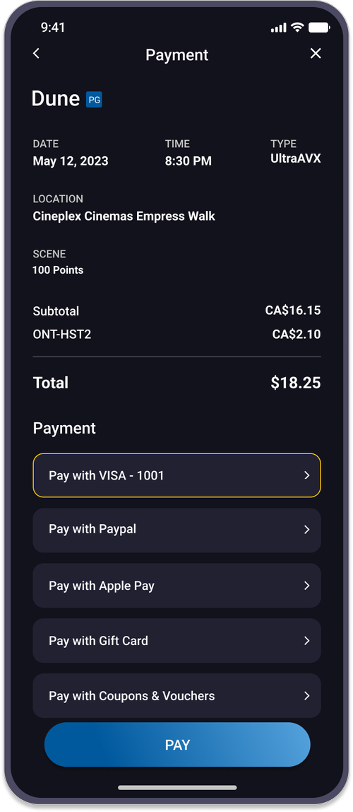
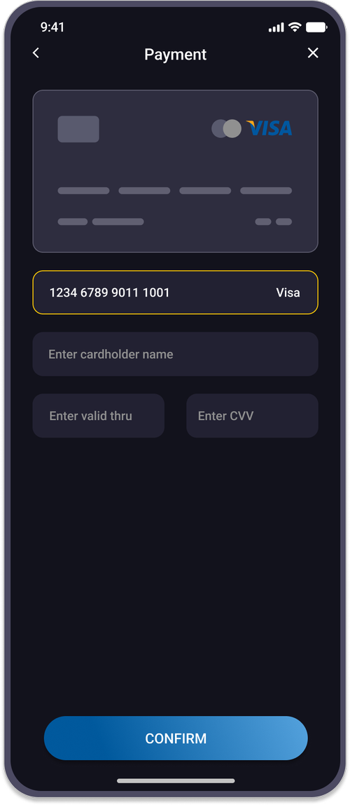
Payment Screens
Analysis of Modifications & Improvements
Below are examples of the analysis of modifications and improvements made in this redesign. Throughout the entire process, I dedicated myself to thorough research and incorporating my own thoughts into refining the details.
App Mockups
Usability Studies
Usability studies were conducted to uncover areas requiring revision based on the current prototype. By observing participants interacting with the prototype, their feedback provided valuable insights for further refinement.
- Search bars are not available yet
- Details of movies cannot be viewed
- The booking process is straightforward with essential selections
- The carousel of movie categories on the home page helps users find specific movies quickly
- Drop-down menus are visually better than buttons for selection
- Google directions to theatre locations are not available yet
Both pros and cons were reviewed by participants. This feedback will guide further iteration — usability studies play a crucial role in identifying potential problems before finalizing the design.
Outcomes
The Cineplex Mobile App Redesign is a passion project driven by my desire to improve the existing design and provide a better user experience. The redesign process encompassed extensive research, design thinking, problem identification, and implementation of relevant techniques and skills.
This project gave me insights into the issues users have faced, while highlighting the potential for designers to solve real problems. While the entire app has not been completed, this marks a strong starting point I plan to continue building on.