TRU Moodle Dashboard Redesign
Redesigning Thompson Rivers University's Moodle learning management system — improving information hierarchy, usability, and visual design.
Context
This passion project originated during my time as a student at Thompson Rivers University (TRU). As a student, I frequently interacted with Moodle — TRU's internal learning management system — for accessing courses, submitting assignments, and engaging with professors and peers. While Moodle's functionality is straightforward, I believe there is ample opportunity to refine and enhance its user interface.
For this case study, I focused on redesigning the dashboards, which are the main navigation within Moodle. I analyzed the existing UI and proposed improvements to enhance the user experience. Currently, I have completed six static pages, with the intention to continue working on subpages.
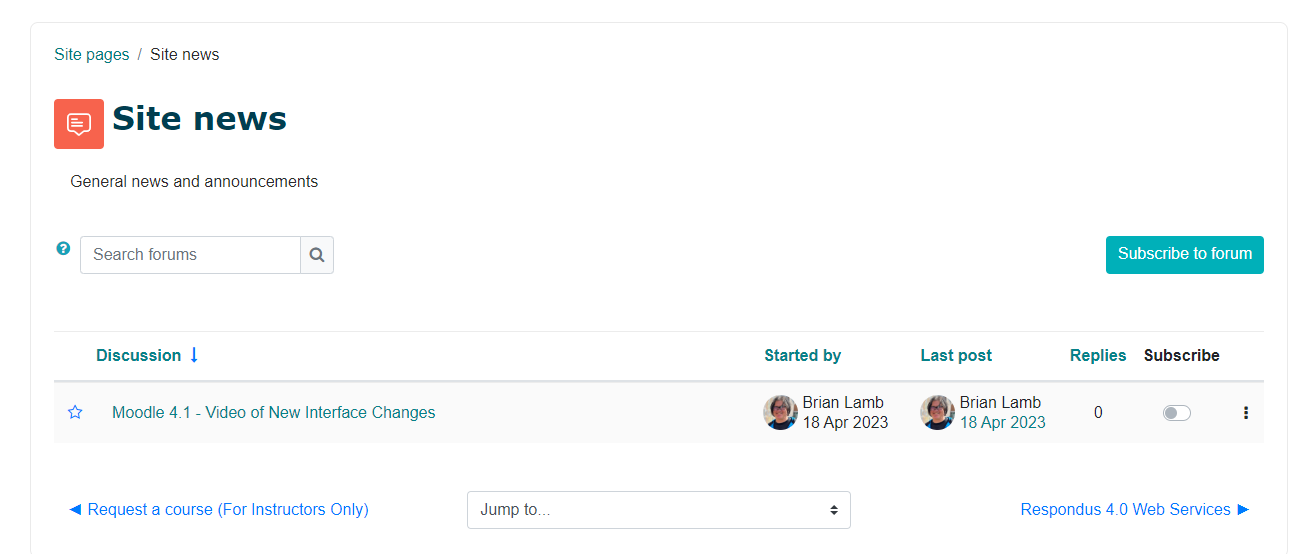
Overview of Existing Moodle Interface
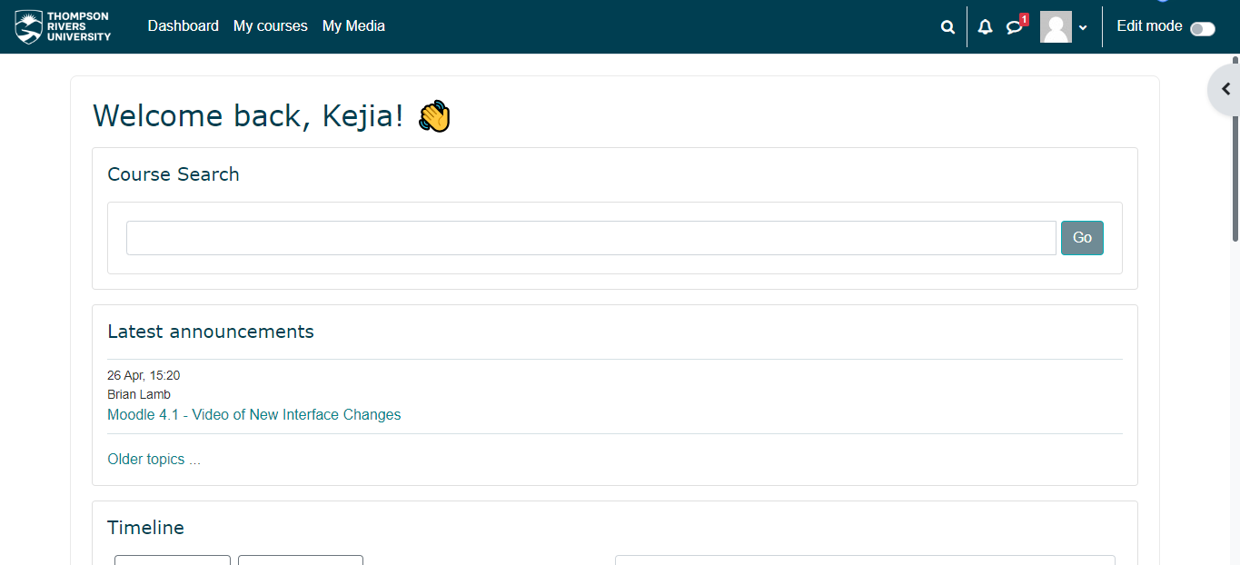
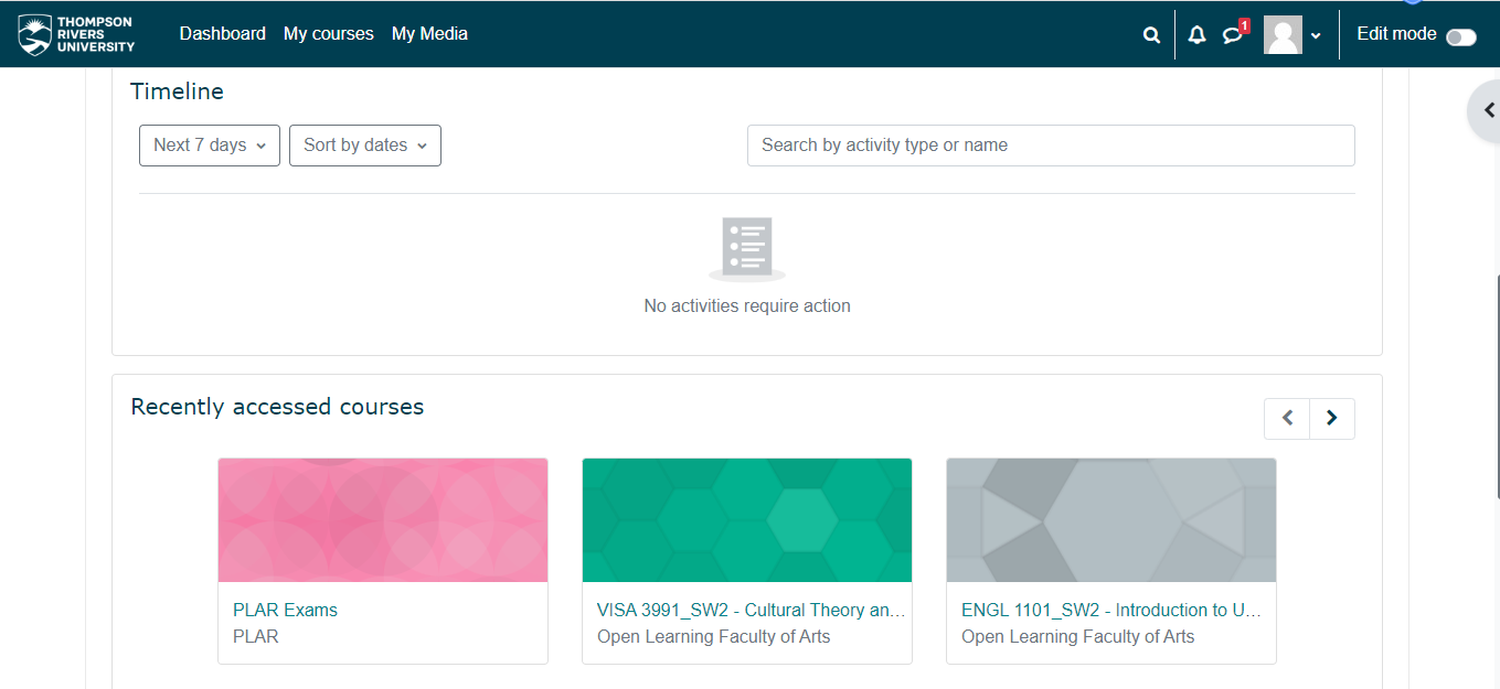
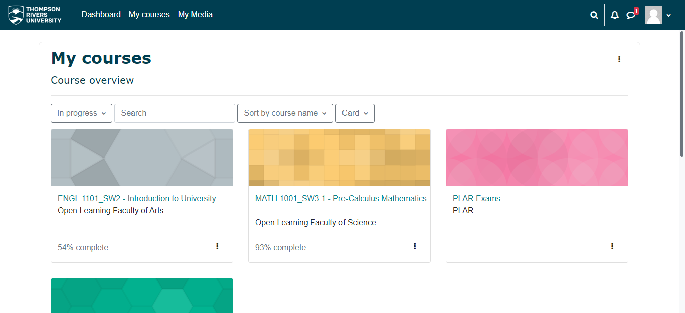
This is an overview of the current Moodle home page after logging in. As you can see, the interface lacks design elements and the information hierarchy is not clear. The information is not properly organized, which can make it challenging for users to quickly find what they need.
Analysis of Existing Static Pages
A couple of problems that I have identified:
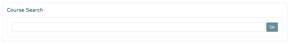
1. There are 3 boxes around the course search bar which are not necessary and making it look quite cluttered.
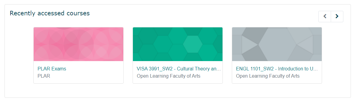
2. Currently, each course is represented by a large rectangle with irrelevant colors, which can be distracting and not provide meaningful information to users at a glance. The most important information — name, code, and progress — should be emphasized instead.
3. There are inconsistent icons displayed in the upper right corners of the interface. The icons vary in size and style.

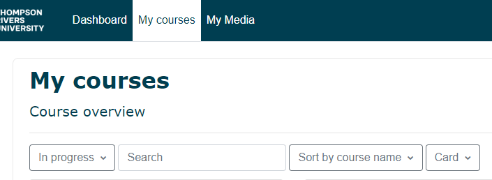
4. After clicking "My courses", users are directed to the course overview section. However, the presence of "My courses" in the header, as well as the repetition of "My courses" and "Course overview" in the section itself, can be redundant.
5. Search bar under My Courses is placed between two drop-down menus which is not intuitive or user-friendly.
6. In the "Latest Announcements" section, there is repetition in the displayed information — two "Site News" items and "General News and Announcements" create unnecessary redundancy. The lack of visual clarity and inconsistent use of colors for clickable elements can make it confusing for users. Also, there is currently only one topic visible, and it is unclear how to access the rest.
There are several areas in which the static pages of the Moodle platform can be refined and further developed. From information hierarchy to high-fidelity UI design, there is ample room for improvement.
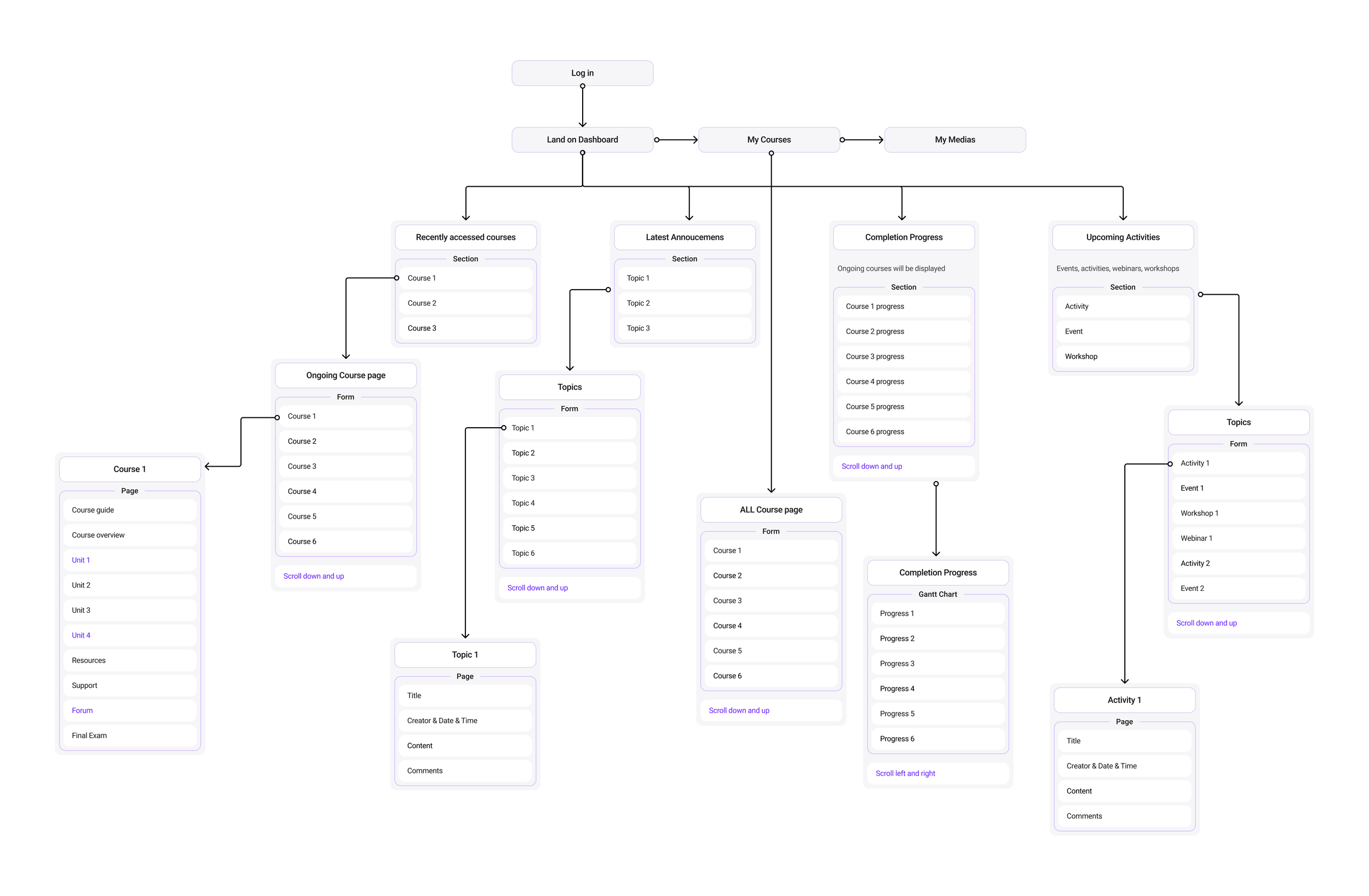
Information Architecture
Low-Fidelity Wireframes
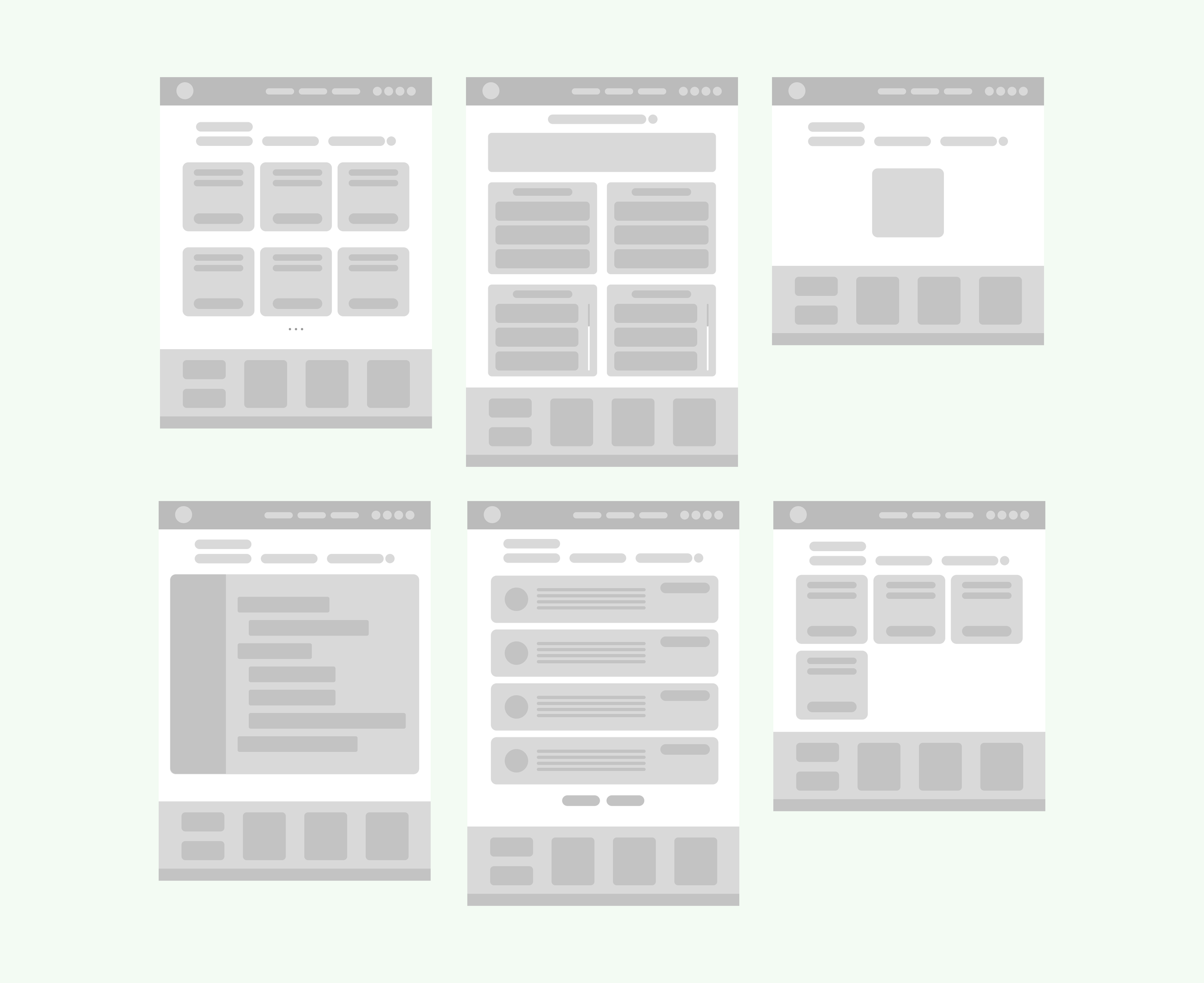
First version of wireframe
Second version of wireframe
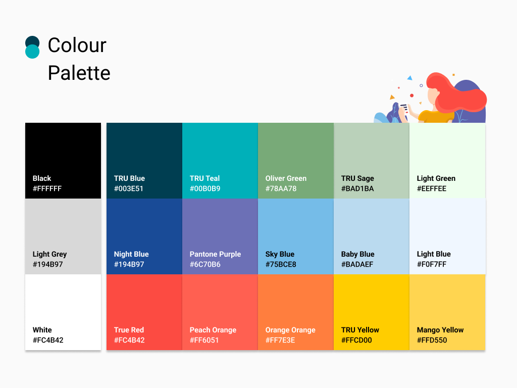
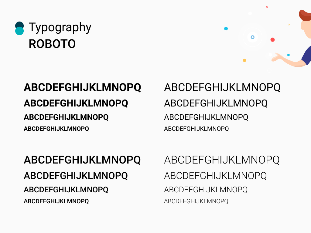
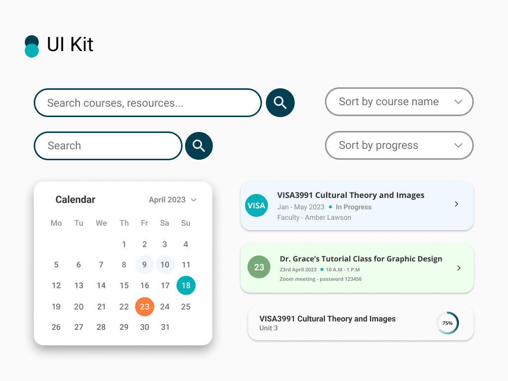
Brand Guideline & UI Kit
High-Fidelity Pages Redesign & Analysis
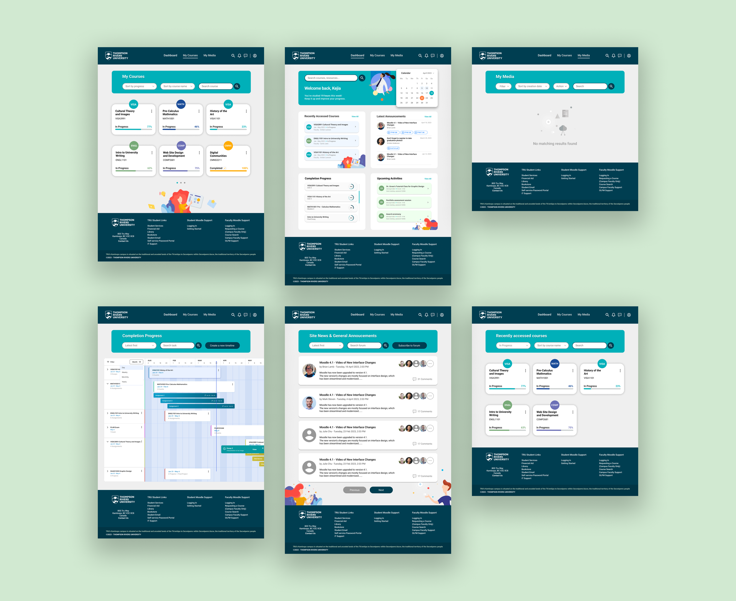
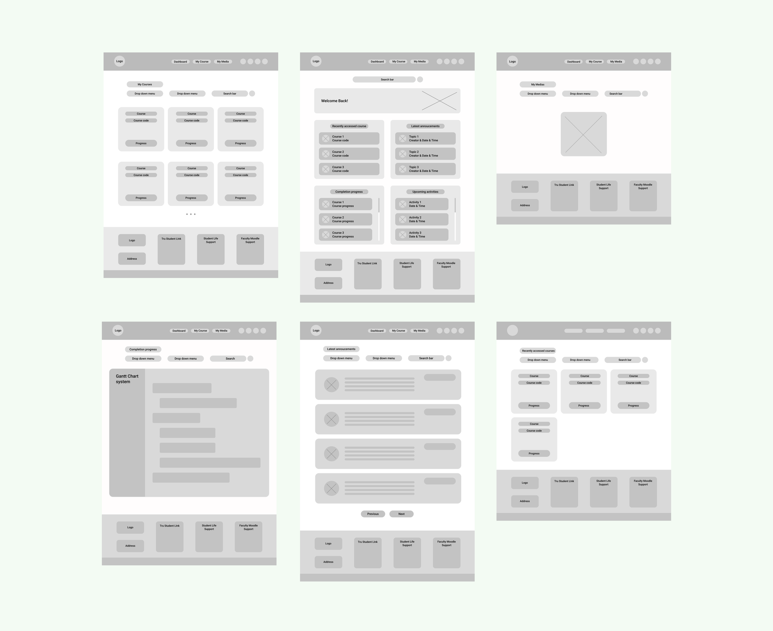
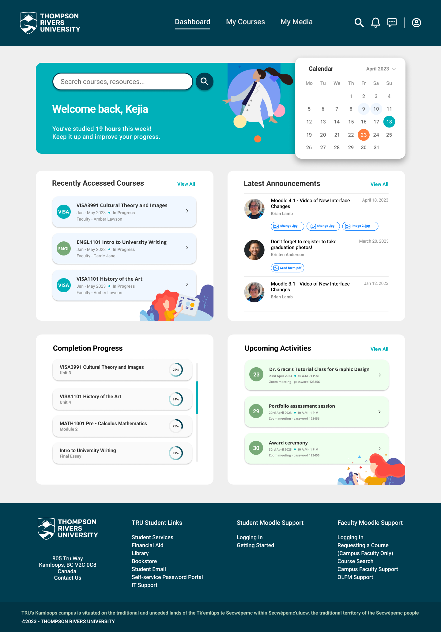
Dashboard Redesign
The TRU header and footer have been retained to maintain consistency with the university's branding. The existing dashboard consists of three sections: "Latest Announcements," "Timeline," and "Recently Accessed Courses." In my redesign, I kept these three main sections while introducing a calendar and upcoming activities section. I also renamed "Timeline" to "Completion Progress", which now displays the progress of each course. Three announcements are shown instead of one, and 2D illustrations add a vibrant and engaging feel.
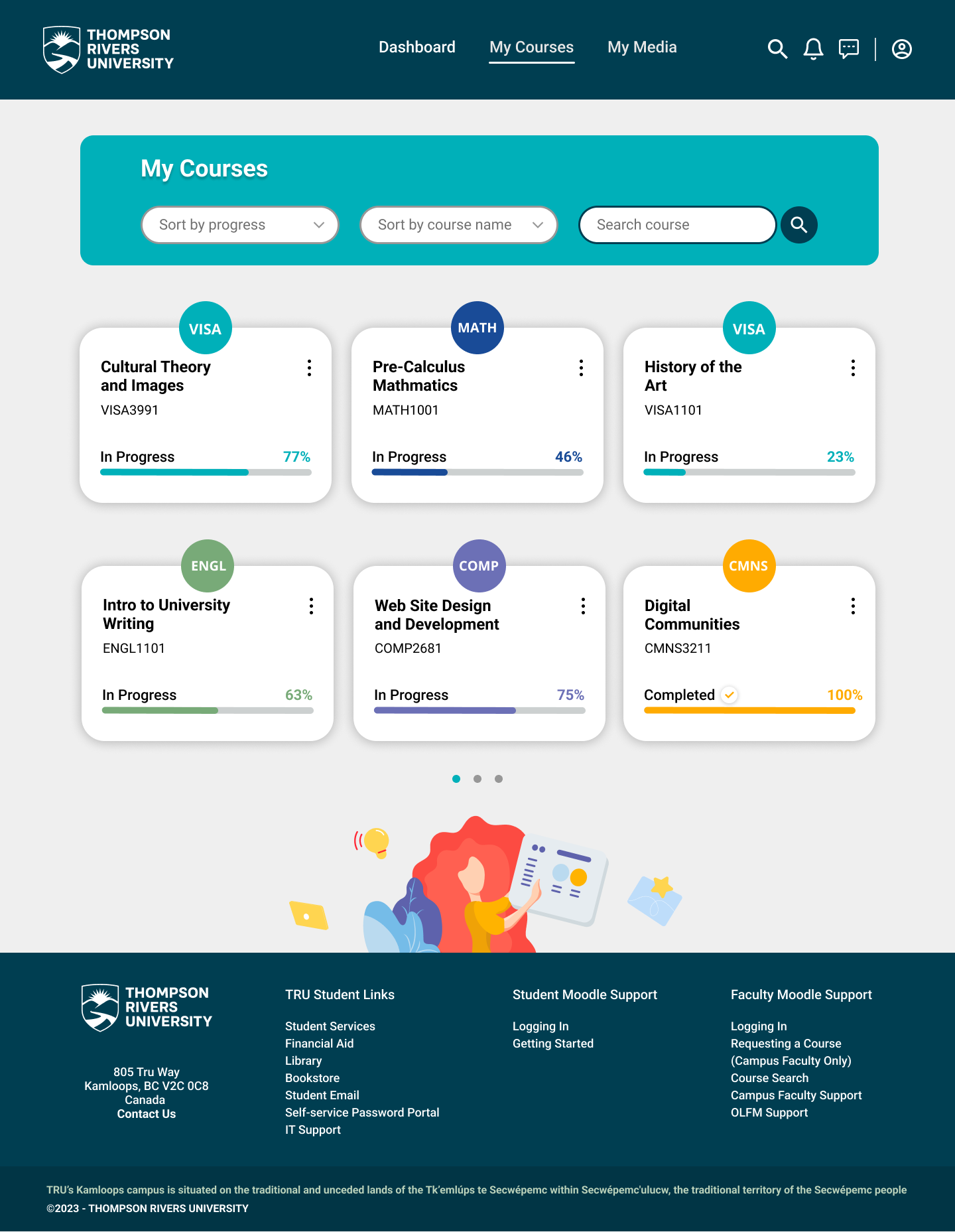
My Courses Redesign
"My Courses" presents a concise overview listing all ongoing and completed courses. Two sorting options have been implemented: by progress/date and by course name/most recently accessed. Courses belonging to the same subject area are assigned the same color — for example, VISA3991 and VISA1101 share the same color. Each course includes a progress bar and percentage.
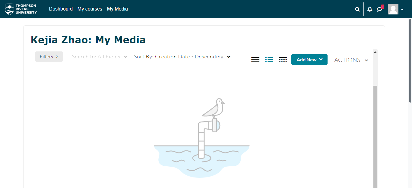
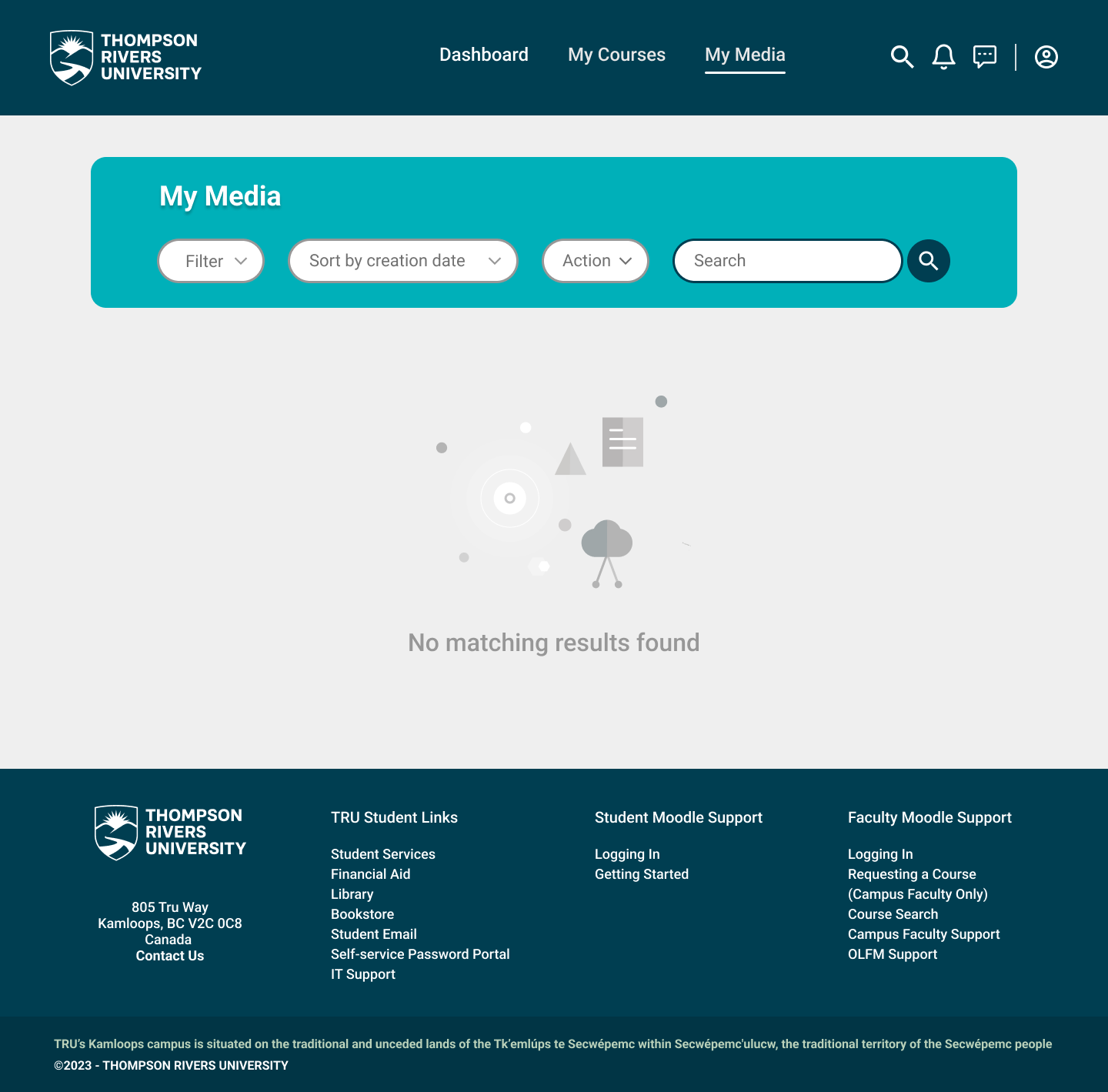
My Media Redesign
Since the original screenshot did not display any content under "My Media", a full redesign was not conducted. However, buttons and drop-down menus have been modified to align with the redesigned pages, ensuring consistency throughout the UI.
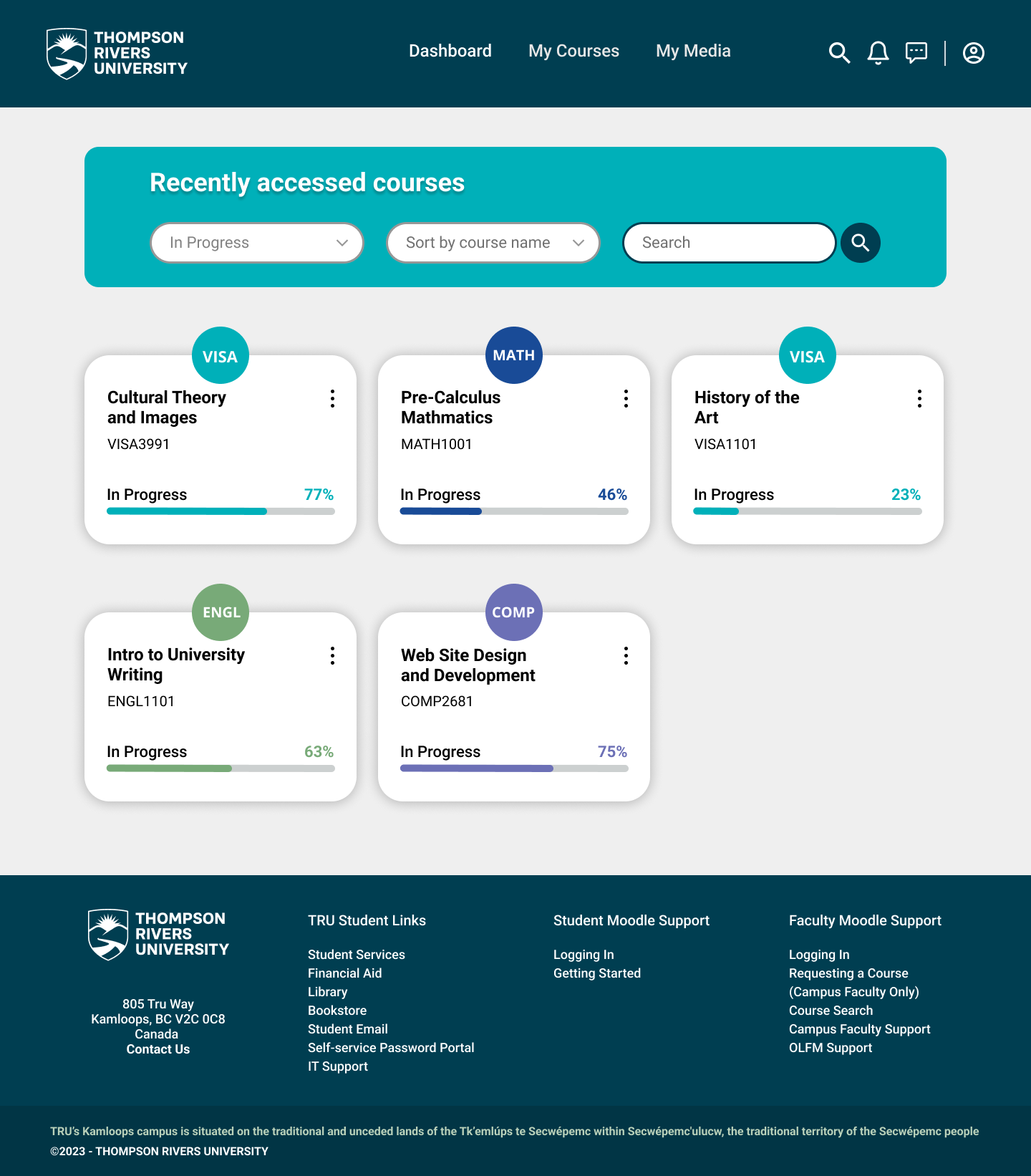
Recently Accessed Courses Redesign
This page displays only the courses that have been accessed recently, excluding completed ones. The overall design and layout of the "My Courses" page has been applied here, ensuring consistency throughout the UI.
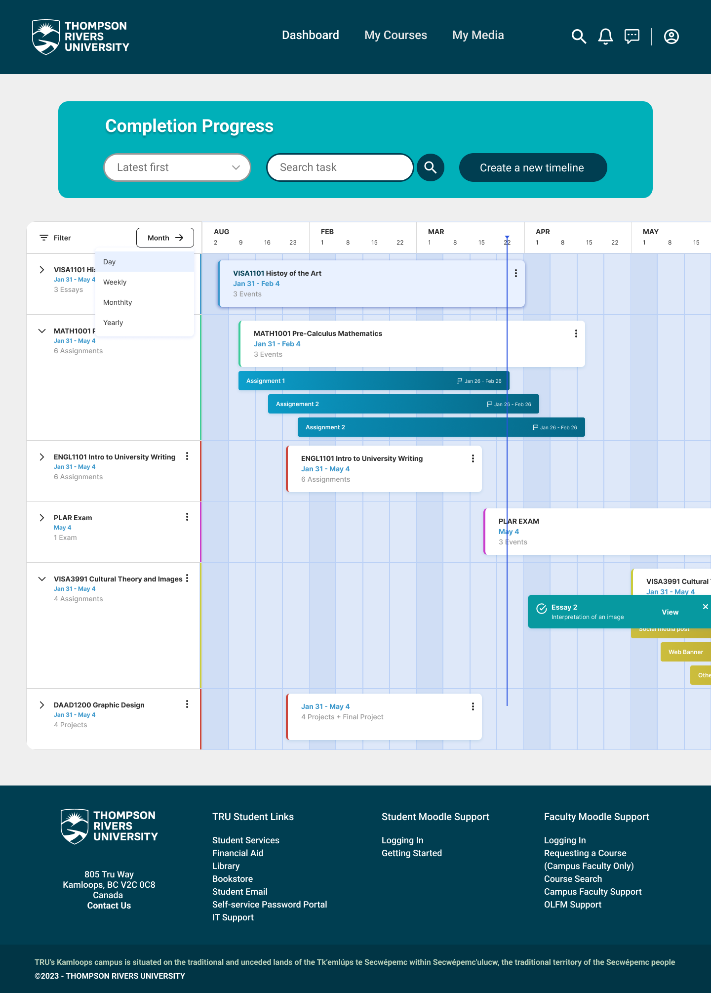
Completion Progress Redesign
The section previously known as "Timeline" has been renamed to "Completion Progress." This page incorporates a Gantt Chart system that enables students to track progress of assignments, projects, exams, and other coursework. The Gantt chart should ideally be editable, allowing students to customize it according to their specific needs.
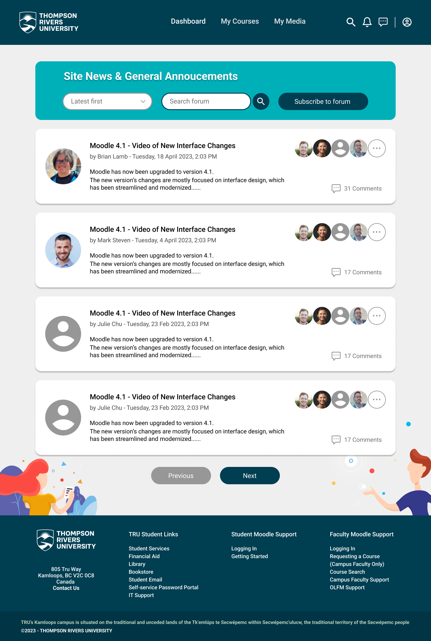
Latest Announcements Redesign
Improvements have been made to enhance user experience and visualization. Each box now contains essential details — the topic creator, a brief summary, date and time, and information about other participants. A sorting feature and search bar have also been added.
Outcomes
While studying at TRU, I used Moodle frequently and noticed its interface could get some improvements. By combining my own insights with research on successful dashboard designs and learning management systems, I developed a more effective and visually appealing version of Moodle's interface. This project allowed me to identify and resolve noticeable issues, and I look forward to improving the overall user flows in the future.